29/04/2014

Visual Communication - End of Module Self Evaluation


I found Visual Communication to be a bit of a mixed bag. On one hand my technical skills and professional attitude improved drastically but on the other I really didn't enjoy the group work aspect of Studio Brief 1, which I felt harmed my input somewhat. 

The group became somewhat fractured half way through Studio Brief 1 due to differing opinions and didn’t fully recover from it. I felt this was quite unprofessional of us all in the group and we should have tried harder to prevent disagreements from affecting our work. However, it happened and we’ve since moved on. In the future I must work harder to prevent things such as this from happening as it reflects poorly on us all and was unprofessional.

On the positive side of things, my digital skills improved within the timespan of this module. We were introduced to Adobe Illustrator in Studio Brief 2 and I’ve quickly grown to love it. I really appreciate  how smooth line work can be within it. I don’t have a smooth drawing ability so to have a tool that can produce this for me is fantastic. Using Illustrator has also allowed me to work more with shape. I am beginning to really see the beauty in imagery created using shape alone. In the concept stages, by concentrating more on shape and less on finer details I was also able to produce work quicker and more confidently. This carried over into my digital process where my production rate increased greatly, largely due to a focused decision to use shape rather than worry about texture.

My increased work rate can’t be entirely put down to the technique I was using though. I made a conscious choice to work harder and have a more professional attitude after the Easter Break. This meant staying later and getting distracted less. I was able to produce finer, better-executed outcomes for Studio Brief 3 as I’d allowed myself the time and thought to do it. My improved time management also allowed me to blog more often. I feel that my documentation was already strong for this module but after Easter my blog posts increased as more work was being produced, perhaps to the point of excess. In the future I will try to limit my blog posts and work to make them more refined.

Going forward into Level 5 I intend to maintain the professional attitude that has benefitted me so greatly in the past few weeks. I also plan on continuing my work with shape - however I need to research further into different illustrators who work with shape for ideas and inspiration. It is research that is possibly the area in which I need to improve upon the most. I’ve come to find that work I produce without the foundations of strong research is my weakest. A solid research base will result in work that is well informed and more impactful. This will help me greatly in Level 5 as I begin to think more about the purpose of my work. 

End of Module Evaluation Sheets

Here are the sheets I used to help evaluate work for this module:


*Note: Title of sheets says Visual Narratives, but is Visual Communication.

28/04/2014

Person of Note: Final Outcomes

Here are the final outcomes for Studio Brief 3

Stamps:


Postcards:


Poster:


Person of Note: Poster Revisited

After the crit I went back to my poster to see if there were any changes I could make to improve upon it. I began by removing the border altogether. With the boarder there it looked like I had simply plonked an image into the centre of my page, daunted by the scale. Without the border there (and dating) the piece immediately looked less morbid and more happy.


However there was also the problem of the large empty space in the centre of the image. I felt this was against the norm of Jim Henson. In many pictures with him in he is surrounded by a vast amount of his creations as seen here. So I decided to add another character - Boober from Fraggle Rock. There are now an equal amount of characters from each franchise which I like.


I then flipped Boober and Ernie over as their heights created a better flow for the image this way. After this I made Boober's fur darker as the blues of his arms and fur were too close previously.


Finally I copied the poster from Photoshop into Illustrator once more and applied the worn effect similar to the previous poster. I am much happier with this poster as it is much friendlier looking which in my opinion is the best way to convey Jim Henson. He was a friendly man.

Person of Note: Printing and Crit 3

Today I printed my work. I chose to print all my work on an A1 piece of gloss paper to give it a nice professional feel. With all my work on one piece it would also be more cost effective too…


After laying out my work ready in a nice manner to display we began the crit.


I received very positive feedback with little suggested for me to do other than touch up a few parts of my blog (such as adding photos of certain parts of my development). However I was still unsure of the boarder of my poster. I chose to play around with it and see it anything good came about.

26/04/2014

Person of Note: Poster Design

I decided for my poster two things, that I'd firstly make it of Henson surrounded by his creations, and secondly I wouldn't rely on silhouettes as much as with the postcards and stamps. Shape would still play a large role though as I intended to keep the image detail to a minimum, preventing it from straying too far from the other outcomes.

I began by finding images of a collection of characters from Henson's career. I also found a picture of Henson himself I felt would work well in the centre of this image. I began by tracing over an image of Animal and transferring it to my main document. I also included a boarder as it would help create a frame for the image.


I then added Red Fraggle and the years of Henson's birth and death. I felt that this poster could act as a remembrance piece for him. Would a Henson fan want to remember him with such a piece?


I then went into Photoshop and carefully cut out the image of Henson to use in my piece.


I changed the boarder to black and added Ludo and Big Bird. I then copied the current image over to Photoshop to see how it worked. I felt the Henson image stuck out like a sore thumb. It just didn't suit the rest of the image. So I removed it. The piece is strong enough without his presence any way.


After this I included Kermit, Ernie and The Worm. I was reasonably happy with this piece. But am a little unsure of the black boarder and date. I feel without Henson being there, it is perhaps unnecessary. 


I then copied the piece over and applied the same worn effect that I had done with my postcards. Tomorrow I'm going to print this out in A2 ready for the final crit in the afternoon.


25/04/2014

Person of Note: Postcards - Revisited

Today I revisited my postcards to rework the worn effect I had created previously.

I used the original files untouched with the worn effect and started from scratch. I used different stock paper types from the internet until I found one that I liked. This time I created a new plain white layer above my image and deleted that rather than the layer I was working on. This way if it didn't work out I could just delete that layer and start again.

Each card was developed further using the same process, however this time I made the worn effect for intense for each postcard as the dates got earlier. This was to suggest that the earlier ones have been around for longer etc.

Here are the final outcomes for those:


Person of Note: Stamps

Today I created my stamps. They were relatedly simply to make but effective in my opinion.

As has become custom for me, I began by finding a stock image of a stamp on the Internet. I then opened it in Photoshop and transformed its shape to meet the 30x50 parameters of the stamp format.


I changed its levels, making the edges pure black or white and deleted the imagery. This was much easier than say opening it in Illustrator and tracing its outline. This method will work just as well, but quicker.

I then copied over the head silhouettes from my Illustrator postcards, made character dates and a 1st class sign then aligned them all together.

As these stamps will be printed out onto a small scale I've tried to keep them as simplistic as possible, with as little detail as possible to stop them feeling over cluttered.

Here are the Final outcomes:


12/04/2014

Person of Note: Poster Development

Today I did more work in my sketchbook, this time thinking about the poster aspect of the brief. I played around with a few ideas. I'm in two minds at the moment however, should I continue to theme of silhouettes somewhat or should I move away from them drastically and create a poster unrelated to the postcards?


Visual Language - End of Module Self Evaluation

Personally I’ve found Visual Language to be the most difficult module I’ve faced this year. This is because I’ve been pushed to discover different methods of Illustration and question the way in which I work. It is due to this questioning of my work that at times, I found this to be the least enjoyable module of the year. However I have also had some of my most defining moments within the briefs.

I now have a greater understanding of shape, collage and composition. I previously felt collage to be cheating somewhat, and shape work too simplistic and easy. I don’t feel that way now; both have altered my working process and have allowed me to grow as an illustrator. It is important that I continue to investigate these processes further and use them to take my work to the next level. 

My attitude towards Visual Language was, admittedly, at times relaxed. It was only with the introduction of Collage, Photoshop and Illustrator that I felt my attitude towards image making really hit a turning point. I tried to refine my analogue work but I feel that digital process is where my skill truly lies.

I found studio brief 2 to be the most interesting part of Visual Language. I’ve always been subconsciously aware of the many aspects concerning composition, however, its only through studio brief 2 that I’ve come to appreciate them. I can now critically analyse my work (and others) on a much more professional scale.


Going forward I need to maintain a committed attitude towards my work. I feel that the areas that appealed to me least were also the areas where I failed to commit myself to. I need to take a more professional attitude towards my practice as I wont always be working on projects that interest me. Now I know what processes I work best with, the only thing getting in my way is myself.

End of Module Evaluation Sheets

Here are the sheets I used to help evaluate work throughout this module:


With the grading criteria I've been brutally honest. I should have had a better attendance and produced much more work than I did.


08/04/2014

Dracula: Where's My Yoyo?

Here's the complete version of 'Dracula: Where's My Yoyo?' the 'ComicCollage' I created involving collage, halftone and colour.

http://issuu.com/t-roberts1316/docs/untitledpresentation-3

Colour, Value and Notan

I was unfortunately ill for the final Visual Language lesson this year so had to find out from my peers what I missed. Luckily I was able to find all the necessary resources I needed to help get me back up to speed. Going into this final task for the Module I knew that I wanted to finish my Dracula Yoyo story from the Collage task. I felt this would work as a great as I could introduced colour to the final act. I decided to focus on one specific piece with which to hand in but create the additional pages as well.

I focused on the image of Dracula actually finding his yoyo. I chose to keep the colour in keeping with the rich red of the yoyo so also used blacks and tertiary purples. I didn't want to create a bright image with contrasting colours as this would not be in keeping with the theme of the story.


After this I created the remaining pages again keeping with my colour theme however when it becomes daylight in the story I flipped the colour to a tertiary orange/yellow on the opposite side of the colour wheel to purple from red.

http://issuu.com/t-roberts1316/docs/untitledpresentation-5

Finally I put all of my pages together to create my full story.

04/04/2014

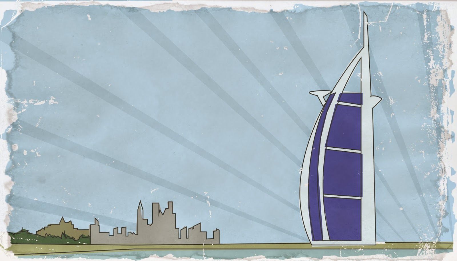
Greetings from....: Worn Effect

Today I went back into my 'Greetings from' brief. I needed to finish my Dubai piece, and I also needed to further my designs after being poorly received in the last crit.

I went about improving my work by using the same worn effect I had learnt during Brief 3 with my Henson postcards. However, here I have had more experience with this process so I feel the effects were much stronger. I used this process several times on the same image to give a drastically worn and torn effect. I am much happier with the outcome of these, despite the fact that I used Photoshop more than I intended.

Here are my pieces now: