18/05/2016

EP: Summative Statement

Throughout my time on this course I have taken on projects from vastly different areas of illustration to varying degrees of success. Whilst I am very keen on creating editorial work, with one of my career goals being to get work in the Guardian, ultimately character and narrative are the driving force behind my practice. 

I feel that this love of character and narrative is most prevalent within my Tory Chums and Beyond La La Land, the former of which has been very well received. That is largely why I decided to focus on my Tory Chums work for my final project. Another aspect of my practice is that I want it to help and inform people. My Tory Chums work, whilst satirical and offensive in places is also quite informative as well. 

My character work has improved drastically over the past academic year as I become more comfortable with the process of illustration I use, however I will continually have to investigate this area of illustration to keep my practice improving. 


My goal as an illustrator is to become a self publisher, making enough money to support myself, whilst also working on projects that I enjoy and help people. I understand that there will be difficulties on the way and I may have to shelve the dream for a few years whilst my skills continue to improve, but I will make them happen with the knowledge I have gained over the past few years.

EP: Project Report

Here is my project report for OUIL603. Please note that the project report briefs are read in order of brief completion. For example Studio Brief 6 was the second brief I complete so is second in the report, whilst Studio Brief 4, my big project, is last as this was the last to be completed.


EP: Presentation Boards - Studio Brief 6 'The Guardian'

Presentation Boards for Studio Brief 6;


EP: Presentation Boards - Studio Brief 5 'Self Defence Guide'

Presentation Boards for Studio Brief 5;


EP: Presentation Boards - Studio Brief 4 'Tory Chums' (Big Project)

Presentation Boards for Studio Brief 4;


EP: Presentation Boards - Studio Brief 3 'Posters'

Presentation Boards for Studio Brief 3;

EP: Presentation Boards - Studio Brief 2 'Crispin Orthics'

Presentation Boards for Studio Brief 2;


EP: Presentation Boards - Studio Brief 1 'Thought Bubble'

Presentation Boards for Studio Brief 1;


EP: Statement of Intent

Here is my initial Statement of Intent (10/15);


Here is my revised Statement of Intent (01/16);


And here is my final Statement of Intent (03/16);

EP: Studio Brief 4 - Reflection

Studio Brief 4, initially just a continuation of my Tory Chums Context of Practice work, was sporadic strips responding to current political news stories. However as my process in Studio Brief 5 slowed I decided to take on my Tory Chums work as my final big project for the year. This meant taking on a different approach to simply responding to news articles.

I settled on creating a short narrative story based around David Cameron’s time in the Bullingdon Club, an all-male diners club at Oxford. This required me to begin a new line of research both visually and theoretically, as I had very little understanding of that Cameron’s life during that period and those he knew. I feel that my research for this brief is quite light, much lighter than that of some OUIL603 briefs. However, with my time frame laid out, I couldn’t allocate too much time towards in-depth research at that point, having to rely on my prior knowledge to inform my work.

Visually, I decided to work digitally for the final outcomes of this brief; this choice was made following my visual investigations in studio brief 3 and 5. I found that whilst not always the quickest process, the visual quality is far more superior than analogue produced work made in the same time frame.

After a tutorial with Fred I decided to not create a collected book edition as I had originally planned. This was due to two reasons. Firstly, the time needed to print and hand craft a unique book was quite high and wouldn’t be a good use of my time. Secondly Fred suggested that social media (where I have been posting my Tory Chums related work) is an excellent platform to get my work out into the world for free, saving time and money.

With such a limited amount of time to create this project I had to use my time extremely wisely and it is only due to continual time management that I have been able to produce a product of a quality I am happy with.

Here is the final outcome for the work;

EP: Print Session

Today I had my print session with James in Digital Print. I was initially unsure what paper stock to use in terms of size and quality. However after a black and white test print in the studio, I decided that A4 would be a more than large enough for the prints. This uncertainty stemmed from my worry that the dialogue within the narrative wouldn't be large enough to read on A4, but after printing those concerns were put to rest. That still left the issue of what type of paper stock to use, i.e.; matte, gloss etc. Joe S. recommended I use gloss as it lends itself better to digital illustration, and when I went to print James reinforced this statement.

17/05/2016

EP: Tory Chums Application

With my Bullingdon Club work now completed I've been giving some thought to how the product could be distributed. Fred suggested keeping it digital, which I agree is correct for the time being. I see myself eventually building a large enough body of work to warrant a website. Beyond that I've also thought that an app for mobile devices would be pretty cool, allowing people to access the strips and stories wherever that are immediately.


EP: Bullingdon Pages Complete

With the deadline fast approaching and my work running behind schedule, I decided to cut out two of the pages of the Bullingdon story. These pages involved an introduction of the narrator - so that he did more than pop up on the last page, and a page of Boris teasing David about off shore accounts. I felt as though both of these pages had similar pages within the story already so their purpose was unnecessary. With my line work taking time to refine removing these two page has been a blessing and relieved some of the pressure.

Additionally, the problem I faced with Boris's appearance has been resolved. As expected, when he was coloured this was enough of a visual cue not to warrant any more attempts to understand his ungodly face.

Here are pages coloured inked and worded;


I have a print slot ready for tomorrow so will now be able to get my work printed and ready by tomorrow, allowing me time to focus on completing my Project Report and additional items left over by this module.

14/05/2016

EP: Bullingdon Outline

Today I created the outlines for my Bullingdon Club story. I created the pages using the technique I have now become quite adapt at, by using myself and found imagery as the basis of my illustrations, drawing over them and refining the piece into a completely different image.


Here is the image afterwards;


I found Boris Johnson's face extremely difficult to get right. He has very unusual features, and I find that every time I draw him I get a very different outcome! I'm hoping that once these pieces are refined and coloured, there will be enough there to act as visual cues beyond his horrid face.

Here are the additional page outlines;


13/05/2016

EP: Tory Chums Postcard - Revised

I had a quick meeting with Fred today to discuss my work for the final show and my postcard design. He approved of it for the most part, however felt there could be small changes made to it. Firstly I needed to enlarge my Zoom Illustration logo, then remove the additional text, leaving just the Tory Chums logo.

Whilst these were all small changes to make, it took a surprising amount of time to finalise. I had to get feedback from several of my peers including Hollie, Becky F and Rosie W before I felt it was perfect. Here are the small changes I made, with the final outcome below;


12/05/2016

EP: Final Crit 12/05/16

Today we had our final crit of our degree. A big moment. I found this crit to be much more informative than the crit we had last week, with many key points being brought up concerning my blog, final outcomes and presentation boards.

Hollie and Rowena reviewed my work and suggested that I make a few mock ups for my final outcomes that aren't going to be printed, with bus stop and book mock ups. Secondly I need to look at my presentation boards and refine them more. Some briefs are okay with one boards others may need two or three. Additionally they recommended I make an additional blog post or two for each brief with a collection of my final outcomes. This was something Fred recommended in my tutorial last week, so I was already aware of this task.

Following the crit this morning I set about reviewing my work to the ILO's and whilst my work does show evidence of each there is more I can do to capitalise on them.

Here are today's sheets;

10/05/2016

EP: Studio Brief 5 - Reflection

Studio Brief 5 was an interesting brief due to it’s evolution throughout the course of the year. Whilst it initially spun out of my Beyond La La Land comic in Studio Brief 1 with the intention of creating more of the same, the brief ultimately changed into a self defence guide promoting safety.

Despite the drastic change of outcome the underlying theme of female empowerment is still prevalent in the end product. Additionally the product’s distribution method understandably changed. Initially the end product would have been a comic, sold in bookshops, comic book stores etc. Then with the change to a self defence guide it was imagined as a leaflet to hand out to victims of muggings etc at police stations or given to participants of self defence classes. Ultimately it ended up being a series of GIF images that would be posted online through social media.

I explored my process at get length through this brief, with my desire to work more with analogue methods of illustration prevalent throughout the early parts of the year. However as my workload increased and time became an issue I found digital to be a better method of production for creating work of a visual high quality. At times this did mean my line work took longer to create, but had I been working with pen and pencil, the time pressures would have resulted in a lesser quality outcome.

Finally, I feel that my understanding of character development and knowledge of form grew dramatically throughout this brief. Where I got into the habit of tracing a found image I now use myself as a reference and use my frame to create an anatomically correct form, before building from there.

Whilst I hit a lull mid way through this brief, I ultimately feel that the process and purpose of my work found a strong direction near the end that I capitalised on to full effect.

EP: Self Defence Guide - Application

With my self defence guide now online I've given some thought as how the product can be pushed further with one of the more logical ideas being to create an app for mobile devices. In the app people would have access to all of the self defence techniques, available in one, easy to access place.

Here are some mock up of the app icon and the app in action;


09/05/2016

EP: Tory Chums Postcard

On Friday Fred suggested that I change my postcard design to focus on my Tory Chums work. With this in mind I used a rough design that I made recently for my Bullingdon Club work. However I altered the piece to include present Tory characters rather than the Bullingdon lot as that story is going to be a one off whilst my present day Tory strips are going to be ongoing and more recognisable. Additionally, the focus of Cameron reaching out for the money is hopefully suggestive go this Government's attitude to grabbing for money from anywhere they can.

Below is the process through to the final outcome for the piece;


In this illustration I drew on many aspects from other briefs in this module, focusing on line work, colour and texture to create a piece that reflects my current visual quality. I will now send this piece to Fred and get his approval before finalising it.

EP: Erica Henderson

Erica Henderson is a comic book illustrator, whose character work I don't personally think much of, however, I do think she uses colour very well within her imagery. Furthermore her work is coloured digitally. This lends itself to Fred's comments in my tutorial last week and makes me feel more comfortable using a strong digital colouring method, as seen by Henderson, for my Tory Chums work.


EP: Self Defence Guide - Online

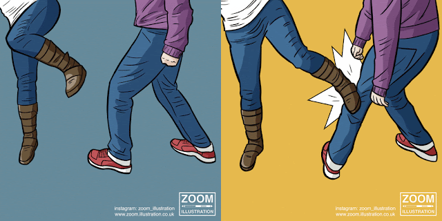
This afternoon I posted the first GIF in my self defence series. It is the title page effectively and doesn't actually present any defence technique on it, but I felt this was an important GIF to have. In the text accompanying the image I warn people that the upcoming techniques can be quite dangerous and should only be used in violent circumstances, emphasising the importance of fleeing the attack as soon as possible.


To get the GIFs onto Instagram I had to upload my GIFs onto the website giphy.com, from there I was able to download an MP4 version of my GIF which I sent to my phone and uploaded to Instagram. This was a somewhat tedious and time consuming process, but until I discover a GIF  upload process with more immediate results, it will have to suffice.


I have already gained a few new followers from this post (I presume) which only bodes well for the upcoming posts.

08/05/2016

EP: Self Defence Guide - Gifs

Here are the series of GIF images I have produced for my self defence guide. I feel that, even though each GIF is only two frames, my work really does come to life when they work together! I have included my branding logo, Instagram username and website address in each image. I have done this as should anyone reuse these pieces my branding will be present, garnering me a larger audience. I chose to only include my Instagram username as that will be the primary platform for the guide, and any more text could potentially distract from the illustrations.


07/05/2016

EP: Self Defence Guide - Coloured

Here are the coloured illustrations for my self defence guide. After yesterday's tutorial with Fred I decided to stick with the same colour palette I have been using recently.


I feel that these images, when fully coloured, have a 60's feel to them with a somewhat pop art visual quality. Had there been more time to work on these I could have perhaps introduced halftone to fully capitalise on this visual quality. I will now begin the process of compiling the work into gif images. I'm excited to see the outcome of this.

06/05/2016

EP: Tutorial 06/05/16

Today I had my last big tutorial with Fred, providing all things go to plan. I began by informing him how my work for Studio Brief 5 has slowed me down recently, and the stress that it had brought. He suggested that I just keep my head down and power on, which makes sense, giving me a few ideas that could save much time. Firstly, after seeing my silly GIF image from yesterday, he commented how it helped bring my work to life and proposed that I could make all of my self defence guide as GIF images. This would save time having to produce a leaflet and getting them printed. Instead I should think of this as a wholly digital venture, with social media and mobile apps as possible outcomes.

He then went on to discuss my work in Studio Brief 3, where he acknowledged an evolution of my line work and colour theory throughout the brief. This filled me with joy, as it was great to see that an outside source understood what I was trying to achieve throughout the project.

Finally, we discussed my decision to change my major brief to Studio Brief 4 'Tory Chums'. He agreed that this seemed to be the right course of action, understanding that I became somewhat lost during my time working on Studio Brief 5. He advised me to keep my Tory Chums work digital, with social media being the platform to it. He liked my idea of creating a book, but believes that will come in time once I have a large body of work. For the brief hand in, high quality prints of my work will suffice. For my postcards he suggested that I use an existing Tory Chums related piece or work or create one, with this being the centre of my practice. I have to agree with him there. Whilst I see my poster work as nice to look at, I don't want people to think that is all my practice is about.

Overall my body of work, with the varying briefs make sense as a cohesive whole, indicating where I want my practice to lie, with political satire at its heart. I'm feeling quite positive right now, more so than I have done in a long while. I have a lot of work to do, but am motivated and eager to complete it.

05/05/2016

EP: Silly Gif

Here's a silly GIF image I made to amuse myself using the work from my self defence booklet;


Whilst I don't really see much use in this GIF, it is enjoyable to see my work animated to humorous effect.

04/05/2016

EP: Self Defence Refined Line Work

Over the past few days I've been working on the line work for my self defence leaflet. Thanks to my refinement in Studio Brief 3 (seen here) I feel that my line work has reached a new level of visual quality, specifically my understanding of line weighting.

Here is the line work I have completed thus far;


The downside to this investment into detailed line work is that I am now two days behind my planned schedule and somewhat stressed now about my remaining time.

03/05/2016

EP: Tory Chums Bullingdon Script

Over the past few days I've been hammering out the script for the Tory Chums Bullingdon Club story. I quickly found that for it to be a more cohesive story I had to sacrifice the idea of have a joke on every page, with some pages relying on visual humour etc to progress the story.

Here is the script;


02/05/2016

EP: Image Outlines

I spent much of today outlining the imagery for my self defence leaflet. I cut away much of photos and fine tuned certain areas in preparation of the line work. This was a somewhat time consuming process which I hadn't expected. Hopefully this process won't affect my schedule too much going forward.

EP: Jeremy Corbyn

This is a quick lunchtime sketch I made of Jeremy Corbyn who is endlessly in the newspapers at the moment for trivial things.


Many of the visual cues that I have been using in other briefs are absent here, but this is a quick study rather than a refined piece. Not amazing, but rather a distraction from my Studio Brief 5 work that is dominating this weeks schedule.

30/04/2016

EP: Self Defence Guide - Reference Images

Today, I finally took a large step towards resolving this brief, having been distracted recently by the PPP hand in. My girlfriend and I took many, many reference images for a self defence leaflet I'm going to create. Seen here;


After looking at the outcomes I have to say, I'm quite happy with my girlfriend filling in the role of 'Red' from La La Land. Part of me is upset to effectively leave the last remnant of my La La Land idea behind, but I'm happy with the direction of where this is going, with many of the themes of the project still present, just in a different capacity.

29/04/2016

EP: Peer Review 29/04/16

Today I took part in a peer review with the rest of the Level 6 students which was somewhat reassuring, however, not entirely informative. The aspects of my work that need to be improved upon are things I am already aware of. My ability to reflect upon these areas and improve on them was also noted, with my blog providing evidence of such. Additionally, my decision to move my big project from La La Land to Tory Chums was well received, being the more logical choice of the two. The water colouring visual quality in my Tory Chums was better received than the digital colouring, if I can combine this method with my recent improvement in line work, I feel I may be onto something big here. Finally my line work and understanding of character form was discussed, with both noticeably improving through Studio Brief's 3 and 5.

To prepare for todays session and best inform whoever was looking at my work, I created a presentation board for each brief I have taken on. I feel this added an extra level of professionalism to my work and helped make my it easier to understand.

27/04/2016

EP: Studio Brief 3 - Reflection

Studio Brief 3 was an interesting brief for me in that the end product was less important to me than the visual investigation throughout. I know this should technically be the case for all of my work, but I feel as thought I really took that philosophy to heart within this brief.


Whilst I initially started out using a dip pen I ended up using a digital brush pen by Kyle Webster that created crisp line work with great variance in weighting. Additionally I feel that my understand of colour has improved with a smaller colour palette. These slightly muted colours allow an extra vibrancy to my work whilst not making the pieces look garish. 

However the brief wasn't a complete success for me, I don't think I delved deep enough into texture investigation. Pieces such as the Mad Max poster and Deadpool show the beginnings of halftone understanding but this really wasn't capitalised upon.

Overall, I am happy with the work produced through this brief, and now have several pieces that, with a bit of tweaking, could work a posters for events such as Thought Bubble and Birmingham ICE.

26/04/2016

EP: Boris Sketchbook Work

Whilst I have David Cameron's visual identity pretty much nailed due to my investigations in CoP, there is much worked needed to be done with Boris, the second primary character of my story.

Whilst other characters will play smaller roles, I expect Boris to be as prevalent as David. He has a very interestingly shaped face, something that I initially struggled to comprehend at first, however after a bit of repetition, I feel that I am a step closer to understanding his face and form.


EP: Wolverine - Complete

Over the past few days I've been refining and colouring my Wolverine piece. Looking at the final piece I feel that my line work has vastly improved over the course of this module and is becoming more evident in my other briefs also. Here is the final version;


I made a number of small changes aesthetically to the rough version, such as the inclusion of a boarder, which I thought worked well with my Mad Max and Deadpool illustrations. Additionally, my understanding of colour and shading has greatly improved as evidenced in this piece however, I feel that the biggest hinderance is that I didn't take advantage of texture play throughout this brief. Some it is evident in the experimentations I made below though;


25/04/2016

EP: When Boris Met David

I have become recently become aware that my knowledge of David Cameron's time at University is pretty limited, so to resolve this I spent my day researching 

Here is the College's website where I began my investigation;

This lead me to the College's Wikipedia page;

Which, in turn lead me a satirical documentary by Channel 4 about the period of time at Oxford when David met Boris and they joined the Bullingdon Club. I initially couldn't find the program via the channel's digital services, however due to the wonders of the internet found it on Vimeo;

Thought the documentary I learnt much about Cameron and Johnson, with accounts from people that knew them, but very little was actually mentioned about the time leading up to David's acceptance into the Bullingdon Club. I feel that this would be a fantastic period to set my short story, with David's initiation into the Club and the subtle beginnings of his strained relationship with Boris. And of course I can include the tale of the Pigs head, or Piggate, as it is known in the media;

EP: Bullingdon Club Poster

Whilst watching When Boris Met Dave today I sketched out an idea for a Bullingdon Club poster. It was inspired by this comic book cover by Tyler Kirkham.


I altered the image to have the David Cameron reaching out for a five pound note, suggesting the importance of money to these people. This is somewhat contradictory to the nature of the Bullingdon Club however, as one of the ideologies of this group is to show the money has little to no meaning to them.


With this in mind I've decided to shelve this poster. It was enjoyable to draw whilst watching When Boris Met Dave, but is defeated by it's mixed message.

EP: Self Defence Guide - Research

With my visual investigation into self defence imagery underway it made sense to research actually self defence techniques. After a quick peruse on the internet I found a site with a list of techniques, poorly illustrated by random images. See here for example.

Whilst I feel the information is quite sound, these techniques could be better illustrated with a collection of illustrations of the same visual quality.

24/04/2016

EP: Tory Chums - Bullingdon Research

After Tuesday's peer review with Patrick, Becky F and Rosie W, I decided that if I am to complete a Tory Chums comic set in the Bullingdon Club Days I'm going to need to research past events rather than responding to topical news stories as The Tory Chums strips currently do.


I found this picture of David Cameron during his Bullingdon Club days, however I only recognised Cameron and Boris Johnson so had to research further who the others were. Luckily I found a news article that explained who each member was.

Bullingdon Club Class of '87

The additional people, whilst having roles within the narrative I'm forming, won't have more than a secondary role behind David and Boris, two people that are very relevant to modern politics.

With CoP and PPP now resolved, I'm happy that I will now be able to devote all of my working time to my remaining Extended Practice briefs.

23/04/2016

EP: Wolverine

With the end of this module fast approaching, I thought it best to wrap up Studio Brief 3, having spent plenty of time investigating line work, colour and some texture in the form of bitmap half tones.  So I set to work on a piece focusing on Laura Linney, the current (female) Wolverine from Marvel Comics.

I began the piece by finding a suitable pose for her character from livemodelbooks.com, a model website Zarah introduced me to recently. I then added two men that would act as criminals for the piece.

Here is the image;


After this, with the characters poses set out I began drawing my own image over the top in a rough. This took a surprising amount of time but I am happy with the outcome, and am ready to refine it over the next few days.


19/04/2016

EP: Progress Surgery

This morning I had a progress surgery with  Patrick, Becky F and Rosie W. In it we discussed each others projects and how they have been moving along since CoP and PPP  finished. Unfortunately mine has progressed that well recently which has warranted a change to focusing on my Tory Chums work.

Everyone was really helpful with feedback and gave me a clear direction on where I should go, whilst reminding me that that is little time left to make a huge project. Becky suggested I could make a piece set with David and Boris at University, whilst Patrick suggested I make work about background politicians akin to the BBC's 'The Thick of It'. Whilst I like both ideas, I feel that combining them to differing degrees would be more effective. My initial idea was for a short comic set around the boys time in the Bullingdon Club, seen through the eyes of a random student. This comic would include references to modern issues such as Tax Havens, The EU and Piggate.

Whilst I am flowing with ideas at the moment, I am also very aware that there is an extremely little amount of time to create this work.

18/04/2016

EP: Final Project Brief

Having recently changed my mind about my final project for OUIL603, I was happy for Fred to provide us with blank brief sheets to fill in today. Since becoming my final project I haven't had the chance to review the brief and make sure it is appropriate for a final piece of work. Additionally, with the advice Fred and Patrick provided us, I feel that this brief has an immediately larger range of possibilities than my La La Land work. See the brief below:

15/04/2016

EP: Presentation Feedback

Yesterday I presented my Creative Strategy for PPP. There were numerous positives and negatives to the presentation that have little purpose here, however one thing stood out, my commission of Tory Chums.

I completely forgot about this work and didn't mention it in my presentation, and numerous people, including several tutors, have since informed me that they were disappointed by its non-presence. However, no one has mentioned my big brief concerning my Beyond La La Land work. This has cemented for me the decision to reign in that work and instead focus on my Tory Chums pieces. Whilst this may seem like a drastic shift, I am confident in my ability with this brief, having focused on it in CoP and continued making work for it since then.

However if I am to do so, I will need to go back into my sketchbook and visually research more to make Tory Chums a truly visual experience to accompany the work.

02/04/2016

EP: Studio Brief 2 - Reflection

I found the Crispin Orthotics brief to be a mixed bag. Whilst I enjoyed creating a piece of work that had a purpose beyond making a profit or looking visually appeaing like my Thought Bubble or Poster work, I don't feel it was necessarily the right brief for me. The brief from my point of view is best suited for a fashion student, of which I am not.

Additionally, I think my design could have done with a more in-depth visual investigation. With this brief I went from research to final design in one sitting and I feel it is apparent. The final outcome, whilst well presented, is somewhat boring and uninspired.

I doubt I will win this competition, but I don't mind as it would feel undeserved. However as stated, I am happy to have had the chance to create a piece of work with a purpose and hope to carry this attitude forward into my remaining briefs.

01/04/2016

EP: Crispin Orthotics - Submission

Today I submitted my Crispin Orthotics work. Me being the fool that I am, completely forgot to send the accompanying competition entry form with my work. Luckily Sharon (who is dealing with the contest on the College's side of things) picked up on this and informed me.

I put my designs onto a project board similar to that which we did in Responsive last year (see here). I felt that this added a level of professionalism to my work, which I feel is highly important to my practice.


31/03/2016

EP: The Two Ronnies

I was saddened to here of the passing of Ronnie Corbett. I've been a big fan of his since childhood and he will be greatly missed. I drew this quick image to post on social media as a mark of my sadness.


I also used this opportunity to continue my investigation into line weighting and shading. Whilst I feel that my line weighting is continuing to improve, my shading seems to have taken a step back. Ronnie Corbett's hair doesn't have the same visual quality that the hair of Clara did in my recent Doctor Who and Clara piece. I feel this is due to the lack of lines within the actual block of shading itself, which is present in the previous work.

28/03/2016

EP: Crispin Orthotics - Design

After some initial research I set about making my design for an ankle orthotic. As stated I wanted to have a futuristic/sports feel to the piece so began by making a hexagon based pattern design inspired by my research.


After completing this I intended to place it on the back of the orthotic where the calf would be. However I thought, with it being the calf, why not mimic the muscle somewhat and have the hexagons fit in in a similar arrangement. So I readjusted the piece.


Following this, I applied to the design to a mock-up orthotic I had created and produced an additional array of colours for the design;


Whilst quite a simple design, I feel it is effective. If I were to need orthotics I would wear this design, thought that comment ultimately means little.

27/03/2016

EP: The Doctor and Clara

Continuing my refinement of drawing using my knowledge of Rachael Slott's visual language, I yesterday created a new Doctor Who piece. Whilst unfinished, this piece shows a marked improved with my understanding of shading and line quality.


Although I am happy with the piece, I feel that the best part of the image consists of the characters heads. My understanding of how to effectively draw hair is really improving and I feel that it shows within this work.


24/03/2016

EP: Crispin Orthotics Research

Here is the research for my Crispin Orthotics Brief. My intention is to create a pattern design with a futuristic sporting quality, the intention being for it to be used by those who have an affinity with Nike et al.

Here is the internet based research I conducted in preparation for the design;


Whilst in a running store later in the day I happened across a range of running shoes, with many having very interesting designs;


I don't consider this a huge brief, however research is still important. I'm intending for my pattern design to have a similar aesthetic to that of this blue Nike trainer.


This trainer perfectly encapsulates the feel I'm going for; a design that will appeal to those who have a feel for sports wear, possibly people who were previously gym enthusiasts etc.

21/03/2016

EP: Revised SOI

Here is my revised Statement of Intent. The briefs have changed drastically since my last SOI, however Fred informed us that is to be expected.


20/03/2016

EP: Iron Man

Recently whilst looking at some of Matt Taylor's work I couldn't help but notice the interesting texture he uses around lighting in his illustrations. For example, his Lost In Translation print;


I decided to try my hand at creating such a quality within my work using Kyle Webster brushes for an Iron Man sketch. Whilst the effect isn't as refined as Taylor's it did create an interesting visual outcome that I can potentially utilise in later work.


EP: Studio Brief 5 - Brief Sheet

Here is the revised brief sheet for Studio Brief 5;

EP: Studio Brief 2 - Brief Sheet

Here is the brief sheet for Studio Brief 2;

18/03/2016

EP: Self Defence Guide Sketchbook Work

After yesterdays crit I went away feeling more confident with this brief and worked in my sketchbook loosely investigating the forms people in defensive stances. I feel that there is a long way to go still with this brief, but I now have a better understanding of posture in defensive positions.


17/03/2016

EP: Peer Review - 17/03/16

Following today's tutorial I have decided to drastically change the course of this brief. This brief initially changed following my previous peer review where Fred suggested I drop the idea of making a full comic, or part of a comic and focus on character/environment design. However my work rate has drastically slowed down since then and I believe it is due to my interest dropping in the brief. This was one of the issues I faced coming into todays crit that I wanted resolved, another being what sense of purpose my work has.

Luckily my peers had some good ideas on how to move the brief forward. Rosie F suggested using my character of 'Red', whom I have already studied in depth, as a character in a self defence guide aimed at women. This resolved both problems I faced in terms of purpose and inflating my interest.

I am now looking forward to moving on with this brief, however I don't feel it has the scope to act as a major project for this module. Whether or not this is the case is something I will need to decided upon soon.


16/03/2016

EP: Dave Brown

I recently came across cartoonist Dave Brown, who largely worked for the Independent. What appeals to me about his work is the vulgarity of it at times. I sometimes think that my Tory Chums work is perhaps too rude to have a wide audience but Brown's work is in a national newspaper, which puts my mind at ease!


14/03/2016

EP: Ice

After discovering Rachael Slott's work recently I couldn't help but create a piece of work that includes several aspects of her drawing style. Slott shows a great understanding of how to draw and shade hair, as well as how to creating interesting variations in line weighting.


Whilst this quick piece of DC Comics character 'Ice' does show some of this qualities, I feel that a deep investigation is needed into this drawing method.

13/03/2016

EP: George's Mask Slips!

Today I watched the Andrew Marr Show, a Sunday morning entertainment/political based show. His guest was George Osborne, who was at his most reptilian. He stumbled through questions from Marr, even getting angry with him at one point. I found this quite amusing as George Osborne often shows his true colours when backed into a corner. I decided to respond to this interview with a Tory Chums strip.


I chose to play around with digital tools as they are starting to become more prevalent in my work again and wanted to play with a different method of digital colouring. I found that the approach I took was someone influenced by Stephen Collins Guardian strips and his use of white to indicate light sources. An example can be seen below;


Whilst I don't think this method of colouring was a complete success, I enjoyed drawing digitally and the digital brush pen I used (courtesy of Kyle Webster), created some interesting line work. I feel that this could potentially be a better method of inking than dip pen with a bit more investigation.

09/03/2016

EP: Alison Character

With so much attention being spent on the Red character, I decided it was time to focus on the other titular character of Beyond La La Land, Alison.

I wanted to drastically change the appearance of Alison as she was the character I was least impressed with in the initial issues I produced last summer. To do this I used the same character sheets I had used for Red;


I found her face particularly difficult to draw from the side and will need to remedy this in the future. Additionally I chose to make her hair shorter and change her clothes to that which she wore in the initial issues.

Following this I wanted to create a comparison image to gauge how she looked next to Red in terms of redesign, so produced this picture somewhat quickly. There are many elements of my recent drawing style missing here such as smother line work and a greater understanding of line weighting, but the piece wasn't produced with that in mind.


I feel that these characters are finally on their way to becoming something that I can market in some way.