31/03/2016

EP: The Two Ronnies

I was saddened to here of the passing of Ronnie Corbett. I've been a big fan of his since childhood and he will be greatly missed. I drew this quick image to post on social media as a mark of my sadness.


I also used this opportunity to continue my investigation into line weighting and shading. Whilst I feel that my line weighting is continuing to improve, my shading seems to have taken a step back. Ronnie Corbett's hair doesn't have the same visual quality that the hair of Clara did in my recent Doctor Who and Clara piece. I feel this is due to the lack of lines within the actual block of shading itself, which is present in the previous work.

28/03/2016

EP: Crispin Orthotics - Design

After some initial research I set about making my design for an ankle orthotic. As stated I wanted to have a futuristic/sports feel to the piece so began by making a hexagon based pattern design inspired by my research.


After completing this I intended to place it on the back of the orthotic where the calf would be. However I thought, with it being the calf, why not mimic the muscle somewhat and have the hexagons fit in in a similar arrangement. So I readjusted the piece.


Following this, I applied to the design to a mock-up orthotic I had created and produced an additional array of colours for the design;


Whilst quite a simple design, I feel it is effective. If I were to need orthotics I would wear this design, thought that comment ultimately means little.

27/03/2016

EP: The Doctor and Clara

Continuing my refinement of drawing using my knowledge of Rachael Slott's visual language, I yesterday created a new Doctor Who piece. Whilst unfinished, this piece shows a marked improved with my understanding of shading and line quality.


Although I am happy with the piece, I feel that the best part of the image consists of the characters heads. My understanding of how to effectively draw hair is really improving and I feel that it shows within this work.


24/03/2016

EP: Crispin Orthotics Research

Here is the research for my Crispin Orthotics Brief. My intention is to create a pattern design with a futuristic sporting quality, the intention being for it to be used by those who have an affinity with Nike et al.

Here is the internet based research I conducted in preparation for the design;


Whilst in a running store later in the day I happened across a range of running shoes, with many having very interesting designs;


I don't consider this a huge brief, however research is still important. I'm intending for my pattern design to have a similar aesthetic to that of this blue Nike trainer.


This trainer perfectly encapsulates the feel I'm going for; a design that will appeal to those who have a feel for sports wear, possibly people who were previously gym enthusiasts etc.

21/03/2016

EP: Revised SOI

Here is my revised Statement of Intent. The briefs have changed drastically since my last SOI, however Fred informed us that is to be expected.


20/03/2016

EP: Iron Man

Recently whilst looking at some of Matt Taylor's work I couldn't help but notice the interesting texture he uses around lighting in his illustrations. For example, his Lost In Translation print;


I decided to try my hand at creating such a quality within my work using Kyle Webster brushes for an Iron Man sketch. Whilst the effect isn't as refined as Taylor's it did create an interesting visual outcome that I can potentially utilise in later work.


EP: Studio Brief 5 - Brief Sheet

Here is the revised brief sheet for Studio Brief 5;

EP: Studio Brief 2 - Brief Sheet

Here is the brief sheet for Studio Brief 2;

18/03/2016

EP: Self Defence Guide Sketchbook Work

After yesterdays crit I went away feeling more confident with this brief and worked in my sketchbook loosely investigating the forms people in defensive stances. I feel that there is a long way to go still with this brief, but I now have a better understanding of posture in defensive positions.


17/03/2016

EP: Peer Review - 17/03/16

Following today's tutorial I have decided to drastically change the course of this brief. This brief initially changed following my previous peer review where Fred suggested I drop the idea of making a full comic, or part of a comic and focus on character/environment design. However my work rate has drastically slowed down since then and I believe it is due to my interest dropping in the brief. This was one of the issues I faced coming into todays crit that I wanted resolved, another being what sense of purpose my work has.

Luckily my peers had some good ideas on how to move the brief forward. Rosie F suggested using my character of 'Red', whom I have already studied in depth, as a character in a self defence guide aimed at women. This resolved both problems I faced in terms of purpose and inflating my interest.

I am now looking forward to moving on with this brief, however I don't feel it has the scope to act as a major project for this module. Whether or not this is the case is something I will need to decided upon soon.


16/03/2016

EP: Dave Brown

I recently came across cartoonist Dave Brown, who largely worked for the Independent. What appeals to me about his work is the vulgarity of it at times. I sometimes think that my Tory Chums work is perhaps too rude to have a wide audience but Brown's work is in a national newspaper, which puts my mind at ease!


14/03/2016

EP: Ice

After discovering Rachael Slott's work recently I couldn't help but create a piece of work that includes several aspects of her drawing style. Slott shows a great understanding of how to draw and shade hair, as well as how to creating interesting variations in line weighting.


Whilst this quick piece of DC Comics character 'Ice' does show some of this qualities, I feel that a deep investigation is needed into this drawing method.

13/03/2016

EP: George's Mask Slips!

Today I watched the Andrew Marr Show, a Sunday morning entertainment/political based show. His guest was George Osborne, who was at his most reptilian. He stumbled through questions from Marr, even getting angry with him at one point. I found this quite amusing as George Osborne often shows his true colours when backed into a corner. I decided to respond to this interview with a Tory Chums strip.


I chose to play around with digital tools as they are starting to become more prevalent in my work again and wanted to play with a different method of digital colouring. I found that the approach I took was someone influenced by Stephen Collins Guardian strips and his use of white to indicate light sources. An example can be seen below;


Whilst I don't think this method of colouring was a complete success, I enjoyed drawing digitally and the digital brush pen I used (courtesy of Kyle Webster), created some interesting line work. I feel that this could potentially be a better method of inking than dip pen with a bit more investigation.

09/03/2016

EP: Alison Character

With so much attention being spent on the Red character, I decided it was time to focus on the other titular character of Beyond La La Land, Alison.

I wanted to drastically change the appearance of Alison as she was the character I was least impressed with in the initial issues I produced last summer. To do this I used the same character sheets I had used for Red;


I found her face particularly difficult to draw from the side and will need to remedy this in the future. Additionally I chose to make her hair shorter and change her clothes to that which she wore in the initial issues.

Following this I wanted to create a comparison image to gauge how she looked next to Red in terms of redesign, so produced this picture somewhat quickly. There are many elements of my recent drawing style missing here such as smother line work and a greater understanding of line weighting, but the piece wasn't produced with that in mind.


I feel that these characters are finally on their way to becoming something that I can market in some way.

04/03/2016

EP: Fury Road LCA Film Society Poster

Adam recently informed me the LCA film society was planning to have a showing of Mad Max: Fury Road and asked if he could use the poster I made to advertise the event. I was happy to oblige and sent him a copy of the file. He put the poster up around the college (which I unfortunately didn't take a photo of) and included it as the banner image for the Facebook group event page (seen below).


02/03/2016

EP: Crispin Orthotics - Briefing

Today I went to the Crispin Orthotics briefing along with a few of the others from Illustration. Orthotics are splints or braces used by patients to improve recovery, to feel more comfortable or to help their mobility.  The current designs have a very limited range and Crispin Orthotics know that students could create some exciting new designs.  Each winning design will not only make a difference for a patient, but the designer will receive a financial reward. I decided to take on this brief as I would like one of my briefs to be one that helps people and is less about commercialism.

With that in mind, it was an interesting briefing in which we were advised not to make work that was overly intricate due to print bleeding etc on certain materials. We also have to keep in mind that there will be image stretching in certain areas such as the heel of the foot.

Although they don't have a definite submission date as of yet, they suggested that it would be around the end of March, beginning of April.

We will receive a full brief early next week.

29/02/2016

EP: Form Investigation

Having been ill over the past few weeks I created this small narrative piece to keep me going;


Whilst I felt there was a breakthrough with the Red character's hair concerning shading etc, I felt that there was a necessity to investigate body and form more. With this in mind over the next few days I again spent some time looking at crossfit enthusiast Christmas Abbott whose body type reflects that of Red.


Following this I pushed the investigation further by looking at line weighting and how that affects the imagery I'm producing. I also approached my process somewhat differently this time, as usually to draw a body I begin by drawing the loose outlines, however I began starting with stick figures first. From this I build the shape on top before refining with more definition in a final layer. I find that this process drastically improves my character work and is something I'm going to take forward from this point on.


Additionally, I applied a few techniques used by comic book illustrator Rachael Slott, giving attention to Red's hair and taking more care with my line quality.

28/02/2016

EP: Rachael Slott

Recently I discovered the work of Rachael Stott a comic illustrator who works for Titan, creating comics for their 'Twelfth Doctor Year Two' series.
Examples of her work can be found on this Pinterest Board.The only negative I would say about Slott's work is that she tends to over-elongate fingers, which can sometimes be distracting.Her line work is fantastic! She has a great understanding of character features and weighting of lines. Furthermore her detail to hair is amazing. Additionally, I love how her line work is so smooth. I have been working with a 'scruffy' live quality recently, but perhaps a transition to smooth line work could be of benefit. I have previously toyed around with a Kyle Webster brush pen tool in Photoshop that I believe will create the effect I desire.

25/02/2016

EP: Fix Up, Look Sharp!

Despite having additional ideas for Tory Chums strips such as the recent Star Wars related strip, I find that PMQ's are more often than not providing me with a strip subject. For example this week, David Cameron commentated on Jeremy Corbyn's appearance during PMQ's, rather than reporting the topics discussed, the media spoke about this comment at length. With this in mind I made this response:


Whilst I feel that I'm becoming more confident with my line work and my new inking nibs, I feel that the colour in the piece doesn't work very well. This is an area I intend to investigate further. Additionally, I feel that the investigation into body and form that I have been undertaking in Studio Brief 5 has been influencing my work here in that I am becoming more relaxed with drawing people in varying poses.

18/02/2016

EP: Deadpool - Tumblr Mania!

My Deadpool poster on Tumblr has exploded with reblogs and likes. At 173 notes it is by far my most popular post. Although I feel that Fan Art is at times somewhat self indulgent and empty of purpose real, I have to admit that it is a fantastic way to get people's attention.


17/02/2016

EP: Deadpool

On Monday my girlfriend and I went to watch the Deadpool movie. I don't know much about the character apart from the fact that he's a comic book character somehow tediously tied to the X-Men franchise. However, I thoroughly enjoyed the film and it's forth-wall breaking lead character.

I immediately knew I wanted to make a poster in response to it. I didn't want to stick to the overtly digital method that I used for my X-Files piece however, so went about inking the piece using dip pens. This resulted in a slightly less refined line quality that somehow worked. During this process I took cues from Charlie Adlard's method of drawing gun fire that really stands out.

Finally, I chose to apply the method of colouring and shading I used for the Mad Max poster to this work also. I did this as I felt the method used for the X-Files poster just seemed too clean.

12/02/2016

EP: X-Files

With the new X-Files series about to air I decided that now would be a great time to make a piece of work for it. Since I began using Tumblr to promote my work I've noticed that there seems to be a fascination on the social network with Gillian Anderson's Dana Scully character, as evidenced below.


With this in mind I decided to create my own Scully illustration that will jump on the X-Files bandwagon hype and get my work out there.


I attempted to show a difference in line weighting within the piece but feel that I didn't take it far enough. An understanding of line weighting is key to the line work of good illustration, and whilst I don't feel mine is anywhere near perfect, the realisation within this piece is the beginning of a greater understanding.

Additionally, the digital colouring within this piece is perhaps too clean. I need to look into different ways to colour, perhaps by using different digital brushes?

EP: Progress Surgery 12/02/16

In today's small group crit with Fred, we were told bring along the work we had thus far produced for OUIL603. I'm quite happy with the quantity of work I have so far, with the pieces from Thought Bubble showing some evolution of visual quality within.

We discussed how I can take my work forward using what I'd learnt from Thought Bubble. I told the group that my goal is to push forward with my La La Land comic that I had at Thought Bubble, however Fred pointed out the danger of trying to create such a comic in such a short period of time. Even though the is three months until the hand in, a lot of the time will be taken up by other 603 briefs and PPP. With this in mind, Fred suggested I change my outcome for the La La Land project and instead base it around character design, having shown some investigation into it already.

Finally, I discussed how well my Tory Chums zine had sold recently and everyone agreed that with CoP now over, it would make sense to continue on with my Tory Chums pieces in some form in 603.

All in all, I'm feeling quite positive at the moment but feel that the idea of character design for my final brief is a bit underwhelming. Hopefully, I'll be able to spice it up some how.

11/02/2016

EP: Red - Character Development

I feel that my character development was one of the weaker aspects of my recent CoP3 module. To prevent this from being the case again, I've spent the last few days focusing on the character of Red and repetitively drawing her different poses/facial expressions.


I've found that whilst I have a good idea of Red's basic appearance now, her hair is an aspect that is causing me trouble. It isn't visually appealing in the way I would like and a further investigation into this area is necessary.


09/02/2016

EP: Fury Road Poster

Last Friday I watch Mad Max: Fury Road and thoroughly enjoyed it! I fully understand why it has garnered such critical and commercial acclaim! The film was none stop action and story from start to finish and felt an overwhelming urge to create a poster in response to it.

After a short time searching the internet I found suitable images of Max, Furiosa and the convoy of vehicles prevalent in the film. I played around with the size of the images until I felt that worked well.  After this I proceeded to outline the image choosing to use a scruffy style of drawing to reflect the voice of the film. I removed the convoy of vehicles from the image as it made the piece overcrowded, with them being too obscured anyway.

I've been quite inspired by the work of Dilraj Mann and Laura Halliwell from Nobrow 8 so adopted the idea of using a limited colour palette for the poster. I settled on two colours, black and a deep yellow, as I felt this piece would work great as a screen print and should I choose to do so, a two colour screen print would be much easier for my inexperienced hands to create.

After colouring the piece however, I felt that something was still missing. However I thought back to the work of comic book illustrators Jock and Sean Gordon Murphy and their use of half tone. The halftone really adds an additional visual quality to his work and I felt the same could be said for my Mad Max piece. Finally Adam pointed out to me that there was an excessive amount of empty space at the top so I chose to include the title of the film as well.


07/02/2016

http://www.theguardian.com/books/2016/feb/07/kapow-creators-shaking-up-comics-saga-bitch-planet-wicked-and-the-divine

06/02/2016

EP: Sean Gordon Murphy

Recently I've been reading American Vampire a comic series written by Scott Snyder, with several issues illustrated by Sean Gordon Murphy. I'm a fan of Murphy's work regardless, but in these issues I noticed that he used halftone as a way to represent tweet like fabrics which I think gives a really cool and innovative visual quality. Evidence can be seen below;


02/02/2016

EP: Fiona Staples

A few months ago Joe Shiels introduced me to Saga, a comic series illustrated by Fiona Staples. I immediately fell in love with her work and recently bought the latest volume.

Here are examples of Staples work;


Her character design and line work is beautiful, but what really stands out to me is her colouring and her backgrounds. Together these aspects of her work, digitally painted, make her work so unique and charismatic! I find her work truly inspiring.

EP: Nobrow 8 Dilraj Mann and Laura Halliwell

Whilst in the library today I was looking through Nobrow 8, a collected book of artwork by different illustrators. The work by Dilraj Mann and Laura Halliwell specifically stood out to me. The line work and colour create a fantastic visual quality in my opinion. I like the idea of using a limited colour palette in my work, having done so in my StarLord poster for Studio Brief 1 and may use it in a future piece, should the brief warrant it.

31/01/2016

EP: I Will Finish What You Started...

Following a tough week for David Cameron involving many public political defeats Adam and I came up with this idea influenced by the new Star Wars film.


I felt the strongest aspects of this work are the colour and the line work. I'm becoming more confidant in these areas and hope to develop them throughout this brief. However I feel that something is still missing from these pieces, what that is will hopefully become apparent as I continue on with this work.

29/01/2016

EP: Studio Brief 3 - Brief Sheet

After some thought about my practice in recent weeks, I have decided that an significant aspect of my practice will be fan art based. I feel that the tutors wouldn't be too keen on pushing this area of work, but I feel it is important. I intend to visit many festivals over the next few years and unfortunately Fan Art makes money, whilst my true passion, narrative, can be a harder sell. SO to help me earn money whilst I build up my narrative based practice, Fan Art is going to have to exist within my work.

Many illustrators do this to create money; such as Matt Taylor, Tomar Hanuka, Olly Moss, Francisco Francavilla, Adrian Tomine and Jock. In many cases they are even commissioned to create these pieces.


If I intend to push forward with this , I'm going to have to look closely at my skills in this area. I feel that one of my biggest issues is my line work. Whilst not bad, it isn't amazing. So I intend that to be the focal point of this brief which can bee seen below.

27/01/2016

EP: Narrative Research

There is a need for a deeper understanding of narrative if I am to create an exceptional comic book story. To do this I have withdrawn three books from the library;


Will Eisner: Comics and Sequential Art: Principles and Practices from the Legendary Cartoonist

Scott McCloud: Understanding Comics: The Invisible Art


Scott McCloud: Making Comics: Storytelling Secrets of Comics, Manga and Graphic Novels

I've browsed Understanding Comics previously and found it very informative, however feel there is much more to learn from it and the other two books.

EP: A Bunch of...

Following David Cameron's reference to refugees as a 'bunch of migrants' at this weeks PMQ's I quickly came up with this short strip in response to the incident. I was initially working on a different Tory Chums Strip but had to put it on hold for this more topical piece.


I feel the colour work within this piece works quite well, with a focus on red, yellow and blue within each panel. Furthermore, my character skills are improving as my confidence with analogue drawing grows. I hope to capitalise on this skill in both this and studio brief 5. Finally the weighting of my line work is well executed in these panels, this needs to be developed further to create a truly engaging visual experience.

21/01/2016

EP: Doctor Who Poster

A few weeks ago, to give myself a short break from my CoP work I decided to draw a picture of the Twelfth Doctor played by Peter Capaldi. For the Thought Bubble event I collaborated with Joe to create a Twelfth Doctor poster, but feel that I can't claim true ownership of the piece as he did the ground work, i.e. the main drawing/ line work.

With that in mind I created my own drawing using the collage technique I have been accustomed to. I printed the piece out on A4 to ink but found that the line work looked too tight and unflattering.


To resolve this issue I printed it at A3 and inked the piece again. This time the lines had space to breathe and the work looked much better for it.


Fastforward to today and I decided to colour the piece and add my unique textures. Initially after applying colour I chose to add a star like texture to the piece but it resulted in making the work look far too busy. I then removed this texture which benefited the piece much more in my opinion.

I am quite happy with the piece so far, but feel that there is much to be improved upon. My line work specifically needs some attention. While it is in no way bad, there is nothing that makes it stand out either.


20/01/2016

EP: Lost Momentum

Since the CoP module deadline I have lost a lot of momentum and my work has suffered because of it. I find I'm tired all of the time with no desire or passion in the briefs I am currently working on.

I'm finding that my lack of desire to work has hampered my Macmillan Prize work so far. The brief itself has failed to grab me which is a shame as it is something really wanted to do, but I feel that it is perhaps best to search for another brief to take on instead.

Additionally, none of the YCN or D&AD have caught my eye and I don't want a repeat of last year where I entered into a competition I didn't care for.

Ultimately I feel as though I am in a bit of a rut at the moment and may take some time out to create a bit of self directed work until this passes.

16/01/2016

EP: Jock

Recently I read a graphic novel illustrated by comic book artist Jock. Jock, despite being referred to as a comic book artist has all of the qualities of a well rounded illustrator. His work reaches beyond comic books into poster design and film production.

Here are a few examples of his work


The pieces of his work that stand out to me most as the ones where he fully embraces loose line quality and half tone. These are both aspects that I feel I could play around with more.

15/01/2016

EP: CoP Tory Chums Work

With CoP now complete I can now continue working on my Tory Chums work in OUIL603. Here is a my development throughout that project that will form the foundations of it's continuation in Studio Brief 4;


And here is the final outcome for my CoP work;


I look forward to continuing my Tory Chums strips. Their development was one of the highlights of CoP.

EP: Cliff Chiang

I first discovered Cliff Chiang's work a few years ago when he was the artist on DC Comics Wonder Woman one of DC's flagship strong female characters. He has such a fantastic understanding of one weighting that I feel my work lacks at the moment. I hope to investigate my own understanding in this area in the future, until then, here is some of Chiang's work to feast your eyes on.


EP: Revised Statement of Intent

Here is my revised Statement of Intent, including briefs that I am now potentially going to take on;


08/01/2016

EP: George's Legacy

I've finally decided to continue work on my Tory Chums strips beyond Context of Practice, which entails responding to current political news stories. My goal is to produce enough to make a book to send to publishers, or create as a small press project.

Recently there has been a news story about China's construction of a golden Chairman Mao statue in an impoverished part of the country. This was met with strong criticism globally and the statue was eventually taken down. I imagine that wouldn't be the case should George Osborne build a statue of himself, regardless of criticism, he would continue building.

Initially I coloured the piece by filling it with flat colours first and shading over, which can be seen here;


However I felt this didn't really work well as it came across as amateurish, so reverted to the colouring technique I adopted for the final outcome of my CoP3 work. This gave a less digital feel to the piece, improving the visual quality greatly.

11/12/2015

EP: Beyond La La Land #3

Recently CoP3 has been taking up a lot of my time, so it was nice to spend some time working on Beyond La La Land #3. Although I've only worked on a few pages, it was nice to remind myself of this world for a short time.

18/11/2015

EP: Group Crit 17/11/15

Today I had group crit. The people that viewed my work commented on the large amount I had produced in preparation for Thought Bubble, with my Tory Chums and La La Land work garnering the most praise.

I feel that these two projects are definitely worth pushing forward with post CoP. However I am reluctant to make too much work concerning them for two reasons; firstly my Tory Chums at this moment is CoP based work and I don't want to include it in this module just yet. Secondly due to my dissertation work needing so much attention, I just don't have to time at the moment to progress with La La Land.

(Inc Scans of Crit Sheets)

16/11/2015

EP: Studio Brief 1 - Thought Bubble Reflection

Thought Bubble is now over and it was a mixed experience. On the positive side, my Star-Lord piece sold well, as did my Tory Chums zine, stickers and notebooks. Surprisingly my Doctor Who print didn't sell as well as I thought it would, despite constant praise from people who saw it.


I also found that my Clone Idle and Beyond La La Land zines didn't sell. I discussed this with Matt and Adam at Thought Bubble and they both suggested this is due to the fast paced nature of the event. People don't feel as though they have the time to stand and read a good portion of the zine like they would in a comic book store for example, where as prints are a quick visual fix that instantly grabs you attention. With this in mind I'm going to take my zines to Travelling Man over the next week, where I will hopefully be able to find an audience there.


Overall I am happy with the body of work I produced and the experience of creating work for an event, but will be happy to begin work on things beyond this now.

13/11/2015

EP: Doctor Who Print

Recently I have been collaborating with Joe to create a Doctor Who print for Thought Bubble later in the month. Our collaboration was based on a simple premise - he draws the main feature (the Doctor) and I do the colours/ background design.

I chose to place the doctor in the time vortex as this would be a great visual to create. Doing this however meant that logically the Doctor's Tardis would need to be included in the image so I asked Joe add this also.

Once I had received the completed line work I created the time vortex using ink textures that have so far been well received. Following this I coloured the piece. When it was finished I consulted with Joe who was happy with the outcome suggesting that a bit of additional shading was needed. We showed the piece to several of our peers who liked it and surprisingly had little or no critical comments about the work.

I feel that the collaboration has worked well and would be interested in working with Joe again in the future.

Here is the finished product;


EP: Victo Ngai - Visiting Professional

Today we had an inspiring talk from Victo Ngai an Illustrator who I previously knew little about, but judging by the tutors enthusiasm, was a big deal. After a quick look at her work this morning I have to say, I can see why people like her work, but it isn't my cup of tea. However what stood out to me was her professional demeanour.

When asked whether she had ever handed a brief in late she lately replied, "no". This struck a chord with me due to my recent slip up with the Guardian Brief submission, that I feel terrible about.

Victo's energy and enthusiasm for work was another highlight and it got me rather pumped for Thought Bubble tomorrow!

12/11/2015

EP: Evan 'Doc' Shaner

Today I came across the comic book artist Evan 'Doc' Shaner whilst reading DC Comic's Green Lantern. His work has a quality that is reminiscent to that of 1960's cartoons made by Hanna Barbara, so I was not surprised to find out after a bit of research that he is soon to be drawing a comic book series called Future Quest starring an array of Hanna Barbara characters.

Shaner works digitally and incorporates Kyle Webster brushes into his work. I added touches of texture to La La Land issue #2 using these brushes and felt they worked quite well, so may return to them in the future. Shane's work makes me feel that whilst my efforts into using analogue processes more are needed, a digital only illustrative route is in fact possible.


06/11/2015

EP: Stickers and Notebooks

To fill out my table at Thought Bubble I created three quick illustrations relating to the new Star Wars film, being that of Rey, Captain Phasma and BB8 (a sure fire fan favourite). I then thought about an achievable range of products that can be created using these images before Though Bubble next week. The easiest to create I my opinion were stickers and notebooks.

So after a short time in Digital Print and hour in front of the guillotine I now have these;


Whilst they were quick to produce they have a strong audience and predict they will be well received at Thought Bubble.

05/11/2015

EP: Beyond La La Land Print

Today I printed off copies of my Beyond La La Land zine. I pulled both issues together to make a zine of 64 pages (excluding cover page) to sell at Thought Bubble. The down side to this is that due to the size of the zine, printing in colour would have cost me a large amount of money. So I printed the pages on typical A4 paper stock in black and white. However I felt that some colour was needed so printed the cover pages in colour on a thicker matte stock of 200gsm.

The outcome has a strong visual quality, despite the interiors being in shades of grey. Whilst it is disappointing not to have the whole zine in colour, it will suffice enough to help build my audience at Thought Bubble.

03/11/2015

EP: Clone Idle Zine

Recently we were tasked with creating a zine for Leeds College of Art's illustration stand at Thought Bubble. I've held off doing so for some time as I chose to challenge myself and needed a full day of availability. I'm taking on the challenge of a 12 pages in 12 Hours, similar - but with a shorter time/page count to the 24 Hour comic challenge by Scott McCloud which can be read about here.

The rules were as follows, I had 12 hours to create a comic/zine from scratch. I had to think of a script, plan it out, draw the pages and add dialogue within that time frame. If I had a break that didn't mean the timer was frozen, it meant it ate into my work time.

Here is the outcome;


I must admit, I did fail - the work ended up taking 14 hours, however despite this - there is much to be proud of here. I created a story from scratch, illustrated it and formatted it in less than a day. If I could do this every day for a week for a week I'd become an illustrative machine. There are admittedly flaws with the work, such as having to use a digital font for dialogue, however I am very happy with the end product.

02/11/2015

EP: Beyond La La Land #2 Complete

I have now completed the 2nd issue of Beyond La La Land. I found that as I went on with this issue my characters still looked quite static. To resolve this issue I began tracing over images of myself in poses that I needed the characters to be in specifically, rather than working the panels to suit images from the internet. I also gave some thought to how my panels sit against opposite pages. Doing so allowed for my later pages, where there was a fight scene, to look more energetic and exciting.

Despite the positives I still feel there is room for improvement with body language. This could possibly happen if I draw the pages in pencil first rather than relying on the restrictive digital drawing process that I currently use.

Here is an Issuu document of the 2nd issue;

16/10/2015

EP: Statement of Intent

Here is my Statement of Intent for OUIL603 in which I discuss some of the briefs I am going to take on. It must be noted that these briefs are likely to change should different projects arise.


15/10/2015

EP: Star-Lord Prints

Today I printed my Star-Lord pieces both in A3 for Thought Bubble and A2 for Travelling Man. I made the piece A3 and hadn't really thought about the visual quality of a scaled up version. Luckily, James told me there would be minimal loss of quality between the two sizes - however this is something for me to bare in mind in the future.

09/10/2015

EP: Travelling Man Poster

Recently I took on a brief in which a group of level 6 students will each produce a poster for the Travelling Man Comic Store in conjunction with Thought Bubble 2015. I accepted this as it is a great opportunity for a wide range of people to see my work, and because I love comics.

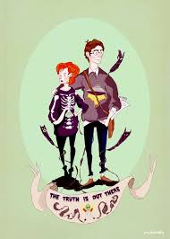
Initially I decided to create a piece about a girl who falls in love with comics, this would be a poster but would have a small narrative to it. Evidence of this piece can be seen below;


However upon talking to the others in the group I realised a more 
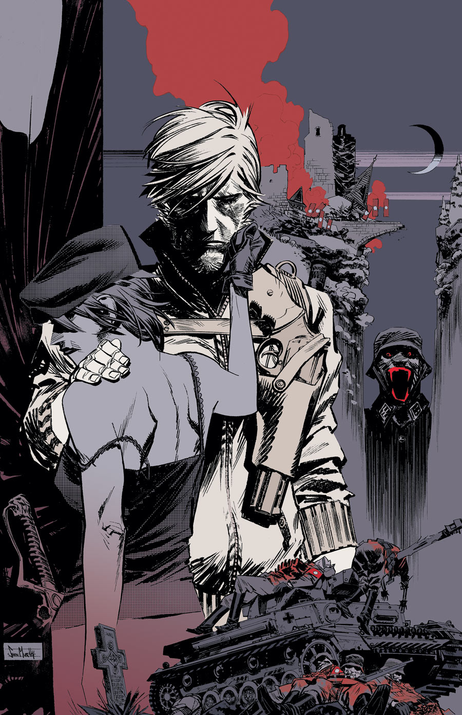
commercial subject would be needed, with people making work about, My Neighbour Totoro, Futurama and The Dollars Trilogy. With this in mind I decided to put to use my Star Lord piece, which would now act as an A2 print for Travelling Man and separate A3 prints for Thought Bubble.

One rule of the poster design was that could only use these colours;


This helped resolve the earlier issue I had with my Star-Lord piece and its moody tones, which would now be brightened up with these colours. I spent a day playing around with these colours until I ended up with a variation I was happy with. Here is an example below, with the final outcome below that;