Showing posts with label StudioBrief 1. Show all posts

19/01/2015

OUIL504: Self Evaluation

Throughout this brief I have learnt many things, most notably the basics in both Dragon Frame and Adobe After effects. Both of which have been played with to the point where I feel quite confident in my abilities to run them properly. I personally feel there is much more time to be spent with After Effects to grasp its full potential. Moving past the digital aspect, I feel that I have also learnt, or rather developed, much further my understanding of screen printing. I was initially hesitant to go back to to this process, and I feel this hampered me later on when several issues arose with my screens (as mentioned in Printed Pictures: Screen Issues). However I feel my outcome for Printed Pictures is much stronger than that of Visual Narrative (OUIL405) from last year where I created a concertina/zine of a similar fashion. I believe that with the addition of screen printing, my work has progressed to a more professional level aesthetically. I look forward to further developing my skills with screen printing.

Concerning my attitude towards screen printing, and my work ethic in general, I need to be more assertive. There were many points throughout this module where I found myself coasting because I felt as though I didn’t have a specific thing to aim for, or I couldn’t settle on an idea. I wasted so much of the early OUIL504 module wondering what to do that I didn’t actually do anything. It was only when I forced myself to sit down and play around that ideas finally started to develop.

I found this to be most prominent during the early stages of the Visual Journal and Printed Pictures briefs. I found that collage, a process of illustration that I first began to develop last year in Visual Language (OUIL404), really was a great source of fun and inspiration for me. It was my ability to look back and take stock of how effective my collage work was that really pushed my Moving Pictures Brief forward. Although I didn’t produce much hand made collage work for the brief I did create a digital collage of images directly inspired by my Visual Journal work. 

Concerning my final outcome for the Moving Picture brief, there are several things I would change if I were to do it again. Most importantly, I would have a look at the pacing of the piece, which I feel is somewhat off, it could do with being tighter near the end and the title portion feels rather segregated from the rest of the animation.

The final outcome for my Printed Pictures Brief I have contradictory feelings for. Whilst the piece works as an ordered piece, designed in Adobe Illustrator. It is this same order that leaves me feeling cold when I look at it. The print doesn’t feel like there is any heart to it and I am finding myself more impressed with my previous screen prints seen here: (Printed Pictures: Screen Print Investigation). I feel that the disorder, whilst not representing Huxley’s ordered dystopia so much, visually looks like a more engaging piece of illustration.

Going forward I feel that I definitely want to bring more collage process into my work. This continues to be a strong area for me and I feel that with a bit more time, I could be onto something very effective. In the future I also need to bring more visual research into my work. I feel that, although there is research of different practitioners throughout my work, it is mostly within Printed Pictures. This benefited my work greatly and helped inspire me during some difficult spells of that brief. I feel that my animation could have been improved upon greatly with the inclusion of more research within the brief. I need to make sure I am researching as effectively throughout to help inform my practise as a whole. Finally, and I feel that this is most important - I need to begin to understand my own limitations. What I picture in my head is always going to be different to what I actually produce. If I set my standards too high then I’ll end up being disheartened with my work no matter how well it turns out.

A Visual Journal: Selected Extracts

Here are some Visual Journal pieces that I feel helped me fully realise my Moving/Printed Picture briefs.


09/12/2014

Illustration 1: Module Evaluation - Thus Far...

1. What skills have I developed through this brief thus far?
I have learnt the basics in Dragon Frame and After Effects to the point where I feel okay with my knowledge; however, due to my lack of work with Moving Pictures at this point I can’t state that I am fully confident with either.

2.  What approaches to methods of image making have you developed and how have they informed your development process?
Collage has played a large role in my Visual Journal, despite this, and my planning to bring this across to Printed/Moving pictures, this has yet to happen, thus hindered the quality/connectivity of my work. I need to revise this.

3. What strengths can you identify in your work and how have/will you capitalise on these?
My experimentation/investigation of media early on was particularly strong and although it has waned somewhat it continues to be an effective factor of my work thus far. This experimentation needs to inform my final pieces more though, as has been stated in my peer review, there appears to be a gap between my sketchbook work and my prints.
 Collage continues to be a strong of visual apsect as stated above. I need to refer back to this to push my work forward.

4.  What weaknesses can you identify in your work and how will you address these in the future?
The past few weeks have been tough due to personal issues, which has been reflected in the quality of my work and attitude towards the module. As I am learning to deal with these issues I must remind myself not to let them interfere with my practice.
I need to stop dwelling on my work. If an image doesn’t work, move on. Every piece of work that I make doesn’t have to be universally revered. I’m still early into my career and can’t expect myself to be producing truly amazing work at this point.

5. Identify 5 things that you will do differently from this point and what do you expect to gain from doing these?
-       - I need to bring collage back into my work, this has continually been noted as a strong area of my work thus far and will help improve the quality of it.
-       - I need to bring more research into my work, I still have plenty of time to research things to help me round off this module and help me produce a better quality of work.
-       - I can’t let my personal issues interfere with my work. Everyone has problems and I need to get on with it. I can’t let my work be victim to external issues.
-       - I need to stop dwelling on my work. I need to stop being afraid of doing work just in case it looks wrong. If something doesn’t look right try to identify what is wrong with it and move on.

-       - I need to understand my limitations. I have an grand idea of what I want my work to look like, but I feel I’m setting the bar too high and overstretching myself rather than focusing on making higher quality work.

06/11/2014

Thought Bubble: Power Rangers Digital Prints

With several designs ready for print the final thing to consider before doing so was to decide which stock they should be printed on. Initially I tried the quality and cheap paper from the draws in the Studio which yielded some surprising results. The quality paper shockingly failed to print well and came out somewhat offset whilst the cheap paper actually worked better albeit somewhat desaturated. I then used stock brought from the library and gloss stock from digital print to judge the difference between the two.

Quality Stock

 Library Stock

Gloss Stock

Ultimately I felt that the gloss stock looked the best whilst cheap paper added a old and worn aesthetic quality to the prints but the library stock looked the best for the cost of production.

The cheap paper cost 25p to produce, the library stock 55p and the gloss 75p. If I am to consider cost of production vs. quality the library stock would probably win out. It is not the most expensive yet is of a more than acceptable quality.

30/10/2014

Responsive: Propercorn Brief Breakdown


I have settled on applying my skills to the Propercorn brief from YCN. The reason for this being that apart from my love of popcorn the brief is quite inviting. Firstly, it appeals to people around my age, which is good as this should help me connect with the audience on a maturity level. The company itself appears to be quite fun and I think much enjoyment will be possible whilst designing a new campaign for them. Finally the brief itself is quite open which will allow me to think a bit differently in my concept work and development of ideas.

What is the brief problem?

How can they creatively bring to life the ethos of ‘done properly’ to the customer?

What is being asked to be done about the problem?
They want to engage with their customers (and new customers) more. They want to be the talk of the town with ‘opinion formers’ and the ‘culturally savvy’.

What is the brief trying to achieve?
They want to challenge the status quo. They want to seem hip and edgy with these young people who love popcorn.

What is the message?
Their popcorn is hip and trendy. It can be eaten as a snack. If you’re a busy, healthy, culturally savvy person - this snack is for you!

Who are the audience?
Opinion formers, young professionals, 20-35y/o’s. Time poor, urban health conscious, culturally savvy and appreciate the arts. Naturally appeals to women but isn’t driven by it.

How will the message be delivered?
The brief is quite open and they encourage different presentation methods such as an illustrated animation, extended narrative of pack design or by revolutionising corner shops.

Who will benefit?
The company. Young people who don’t want to feel guilty for eating popcorn. Snackers. People with busy lives. Health conscious people. Women.

Can you foresee any problems?
Although the brief is quite open, which is a good thing, the lack of restrictions could be problematic. Where do I go with it? Should I attempt to drastically change what has been before? 

29/10/2014

Thought Bubble: Power Rangers Screen Print

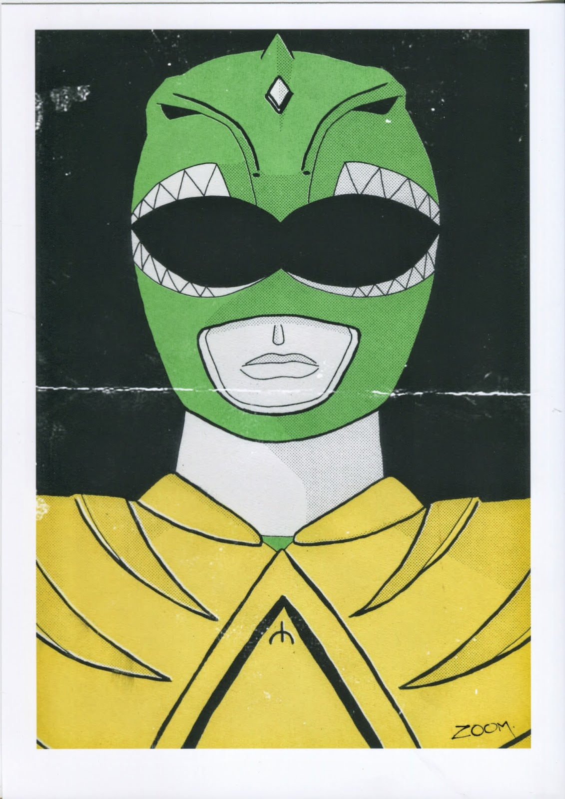
Today I had my re-induction into screen printing. I was going to work on my Printed Pictures brief for OUIL 504 but due to my own failure to manage my workload correctly in that area I didn't have a suitable piece ready. However I had been working on a Green Power Ranger piece in my spare time last week for Thought Bubble 2014 so decided to use that.

Initially the screen printing went well in terms of set up, exposure and paint colour, then I came to do the second screen colour and realised that I hadn't placed markers on my colour layers. This resulted in me having to guess slightly where certain layers would land. Still, of the 10 screens produced, one came out well. This is something I need to be aware of in the future.

Using the screen that worked I edited it on Photoshop to have a worn effect similar to what memorabilia from the 90's would presumably look like today. This is quite in keeping with the spirit of 'collective culture' often seen at such conventions so I am quite pleased with the outcome. I plan to mass print these digitally for the Thought Bubble event.

26/10/2014

Hyde Park Picture House: Scott Pilgrim Poster

Over the weekend I created my entry for the Hyde Park Picture House poster competition. I went into the brief aware that I wanted to work quickly due to my heavy workload in other areas so I immediately ruled out drawing of any kind. Instead I focused on collage, an area that I have been interested in since Visual Language last year. I began by collecting a series of images from the already existing Scott Pilgrim Movie campaign.


From these images I sketched out a few ideas for poster designs, my favourite being a design that calls back to a wrestling event poster with characters on either side of a 'vs' symbol.


I then made a rough collage of images within Photoshop and refined from there; playing with size, colour, halftone etc. The development for this can be viewed below:


As stated above, I chose to make this a quick response, however despite of this, I am very happy with the outcome and hope to at least come in the top 5 finalists.

23/10/2014

Thought Bubble: Leeds College of Art Short Course Postcard

Today I submitted my postcard entry to raise awareness of Leeds College of Arts' Short Courses at the Thought Bubble Comics Festival 2014.

I considered this to a relatively simple and open brief (being 'design a postcard for the college to encourage people to take our short courses). With that in mind I didn't want to invest too much of my time into the design when I have more pressing matters to attend to, so gave myself a day to make these.

I began by drawing out a few idea outlines before settling on one, from this choice I made four different designs. I asked several of my peers which they thought was best. Of these, two of the designs were frequently chosen so I pushed forward with those. I photocopied my outlines, enlarging them by 50%, and inked over them. After inks, I added colour in Photoshop and, being aware of the Leeds College of Art logo, used its outline as a way to frame the images. Finally I added the actual Leeds College of Art logo and several silhouettes to give the postcard more energy.

The development of the postcards can be viewed here:

Responsive: Outcomes and Brief Breakdown

What do I want from this module? That was the question we were asked today. We began by writing down ten answers to that question before being put into groups and doing the same. After this the whole room pooled our desired outcomes together to create a definitive list of ten.

My desired outcomes:
1. Get my name into the professional circuit
2. Learn how to decide which briefs to attempt
3. How to be a professional illustrator
4. Know what to do if I have a bad client
5. Gain confidence
6. Gain experience
7. Develop as an illustrator
8. Learn to enjoy competitions
9. To continue the feeling of having a constant workload
10. Be. A. Winner

The group's desired outcomes:
1. More experience
2. Get work out into the world
3. PRIZES! (Win all the things)
4. Improve as a professional
5. Create opportunities
6. Potential internships
7. Learn new things
8. Networking
9. Know which briefs to take on
10. Gain confidence

The collected room's definitive outcomes:
1. Broaden opportunities
2. Win stuff!!!!
3. Professional feedback
4. Networking opportunities
5. Confidence
6. Workload management
7. Working to deadlines
8. Working with clients
9. Experience
10. Locating your practice

From this we came to conclusion that despite all of the other rewards that await us - WINNING is the most important thing. This competitiveness is something that I felt was missing from last year. I personally don't think winning is the most important thing in life (it would be pretty darn good to achieve something big from this though).

We were then handed out past YCN briefs to break down and figure out. From these we discovered that the companies concerned aren't as almighty and terrifying as first thought, in fact they could be considered desperate to an extent. They need us as much as we need them.

Using this knowledge of how to break down a brief I've decided to go back and look at the three brief's I have chosen to enter thus far, ultimately choosing one to go further with.

22/10/2014

Responsive: Live Briefs

In preparation of our Responsive session this week I've selected three briefs from the YCN website that interest me for differing reasons.

Oranges Are Not The Only Fruit
http://www.penguin.co.uk/static/cs/uk/0/minisites/penguindesignaward/adult_fiction_brief.php

I have selected this brief as it appears to allow a large area of experimentation, which will be achievable due to the extended timeframe. Furthermore it is a book cover, and being a book enthusiast I feel it'll help push my work as I'll  have an invested interest in it.


Propercorn
http://www.ycn.org/awards/ycn-student-awards/2014-15-ycn-student-awards/briefs/propercorn

Having worked in a cinema for nigh on 3 years I developed a taste for popcorn and can appreciate what a marvel of food technology it is. I love popcorn and insist on eating it a minimum of 5 times per week. I can think of no other brief that I'd enjoy doing more than this. Popcorn.


SyFy
http://www.ycn.org/awards/ycn-student-awards/2014-15-ycn-student-awards/briefs/syfy-uk

I'm very passionate about Sci Fi and used to watch SyFy quite regularly. However I now fall into the category of the 74% of people that are aware of the channel but don't watch it. I want to complete this brief to not only help promote SyFy but to also remind me of what I found attractive about the channel in its heyday.

18/10/2014

Thought Bubble: Zine Development

As a live brief, I've been working on a zine entitled 'My Failed Youth' for the Thought Bubble Comic Festival 2014. The narrative details an over exaggerated reflection of my exploits as a 19 year old. This is designed to be a humorous tale, but also a cautionary one as growing up I never had anyone to guide me with such tales and would hope that others can learn from my mistakes. The original idea for the zine came about when I first read the Scott Pilgrim Graphic Novels by Bryan Lee O' Malley. These graphic novels explore the life of Scott Pilgrim and details his mistakes and maturing of character throughout.


Initially I wrote a script for the first issue (of what I hope to be an ongoing series) and sketched out rough page layouts on Photoshop. Once all pages were laid out I then went about drawing them on paper in a simplistic fashion using the work of Jack Teagle as inspiration. He has such a basic style yet manages to effectively tell engaging stories.


Often I've found that creating something like this has never really worked out, largely because I've never given myself a timeframe or have been overly critical of my skills resulting in me giving up on the project. With this zine however, I have overcome these issues.

With the festival being just under a month away I couldn't allow myself to dwell on my negative attitudes towards my technical ability. Instead I focused more on the narrative of the piece in the hopes of having the work ready in time.

Here is a developmental page from the zine:

16/10/2014

A Visual Journal: Other Futures

Over that past week I've spent some time researching different interpretations of the dystopian future theme within film and book.

Films include:
Blade Runner
1984 (2987)
Back to the Future
AI
Wall-e
The Running Man

Books include:
1984
We
The Hunger Games
A Clockwork Orange

I don't know where I'll go with this research but it is good to have a comparison to Brave New World.

I also watched the 1998 TV movie of Brave New World which was an interesting interpretation however it was clearly held back by the budgetary issues of a TV movie.

12/10/2014

A Visual Journal: Interim Self Evaluation

So far from this module I have gained or improved upon several skills that I feel will benefit my practice:
- I have developed my ability to think quickly during production, many mistakes I made led to my work developing in different ways.
- The use of motifs gave me the chance to explore themes from my author in a wider way than I would have thought possible.
- The brief thus far has reminded me how much I enjoy collage, a process that I came to use often in Visual Language during Level 4. I plan to use it more in the future.
- For the first time I have began to create my own textures using inks and paints. I haven't done this before but expect I will be from now on.
- Finally I have rediscovered the use of photocopiers, a fantastic method for mass producing collage textures.

Throughout my Visual Journal I plan to explore further severals things:
- Firstly I'm going to try using different motifs.
- I found I have mostly used black and white thus far so plan to use more colour if appropriate.
- I really enjoyed collage and creating textures so plan to use these more.
- Having rediscovered photocopying I plan to use more of their abilities such as negativity.
- Finally I plan to work under short time frame where appropriate.

I plan to go further with the motifs of 'War' and 'Urban Decay' as I found they go hand in hand visually. However I plan to replace 'Product' with something similar in tone to the prior two such as Labour for example as this was more in line with Huxley's concerns of the future.

As I stated I want to use photocopying more but to do this I will need to investigate the different techniques/methods of photocopying to create a wide range on visual imagery. I also plan to read more books concerning the future we are creating for ourselves - both fictionally and factually. I also plan to do more external research by visiting and taking photographs.

09/10/2014

A Visual Journal: Texture and Collage

Today (having been ill for a few days) was mostly spent catching up on work that I'd missed. I began by created several textures that evoked an intangible sense of my motifs.


I made these with the knowledge that I was going to use them to create images using the motifs of 'war' and 'urban decay'. I decided to drop the 'product' motif for this task due to the nature of forcing it to work alongside the prior two motifs. My first attempt used a bright colour theme that I felt didn't work with the tone of my motifs so I decided to limit the use of colour within the work. My initial pieces didn't work too well either due to the fact I was hurriedly throwing them together. So I took a step back and thought about what I was exactly trying to convey intangibly.


These later pieces worked better as I, for the most part, kept the same format (distant shot of a city) and tweaked different aspects to allow varying degrees of results. This task reminded me that I enjoy collage work but where can I go from here with it?

07/10/2014

A Visual Journal: Image in Shape

Using the 3 motifs I have chosen from the theme of 'dystopia' I began to think about using cut outs from magazines and other miscellaneous ephemera to create images made purely of shape. I questioned how I could convey the motifs of 'war', 'product' and 'urban decay' using such a simple process of image generation.


Whilst I felt some of these images worked, I am aware that I was still too reliant on line to create texture (as can be seen above). We were later permitted to use line intentionally with the shape cutouts - despite this freedom I still tried to push my use of shape also.


I feel that these outcomes improved upon my first attempts at shape using cutouts. I had become aware of using line as my primary tool and tried instead to use it as an afterthought thus forcing me to be more reliant on shape.

05/10/2014

A Visual Journal: Theme and Motifs

Considering the theme of 'dystopia' I selected three motifs that play a role in Huxley's visions of the future. These were; a desire for 'products', the world falling into 'war' and the general 'decay of the urban environment'.

Using these motifs I collected a small amount of stock images from the internet to use as reference material for a drawing exercise.


The exercise involved the creation of different lines using varying styles and weights. I broke my stock images down into their most fundamental  aspects and used my newly created lines to draw them.


What I found was that some of the lines complimented the images well whilst others, though perhaps useful for other work, didn't fit what I was working on at the time. For example, the Mac Book drawn using using a fuzzy haphazard line didn't suit the image - but the line itself may come in useful should I need to, for example, draw a furry animal.

21/02/2014

That's Pants!!!: Queue Gif Final

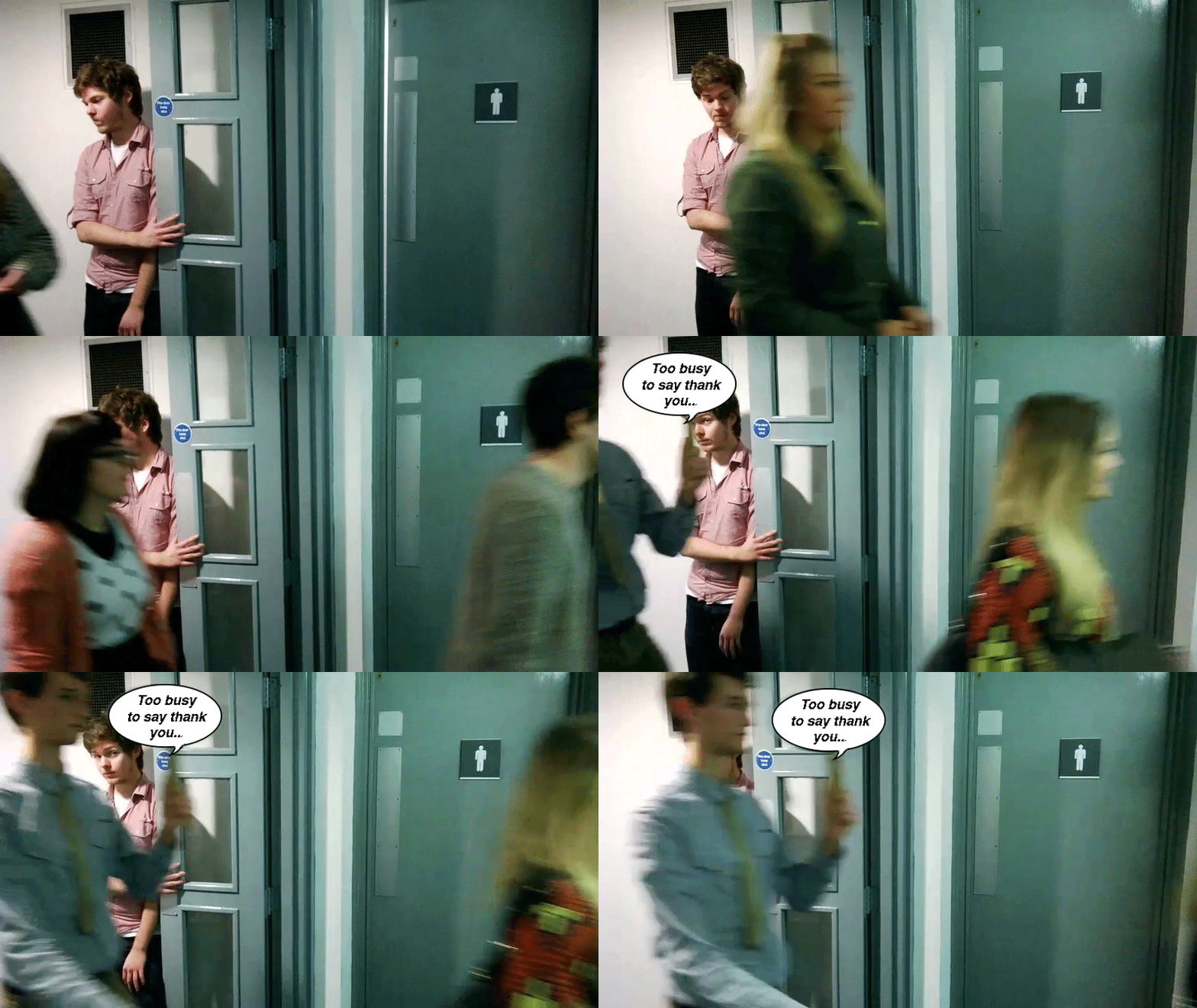
After a bit of thought I decided that the gif image we've already made will be suitable to use for this brief with just a small bit of editing.

The biggest issue I had with our gif was that the message displayed in the clip was blurred, so I simply opened the file and made a new speech bubble for each frame.


This didn't take too long, however I then encountered a problem - I'd somehow messed by gif up. It now played erratically and jumped frames without any indication as to why. Furthermore when the speech bubbles appeared they all did so at once instead of moving frame by frame as I intended.


After about half an hour of messing around I eventually discovered that it was due to the visibility icon in the layers box. Each frame consists of its own set of layers and each of these can be visible or not. So it was simply a case of making sure each speech bubble position was visible for each corresponding frame.


Once this was done there was just the case of timing to resolve. I previously had the gif timing at 0.05 and 0.5. Instead I chose to speed the gif up by having that frames at 0.02 for the queue and 0.05 for the speech bubble frames. This makes for a quick gif but allows people to view the message in the speech bubble too.


17/02/2014

That's Pants!!!: Gif Research

Today I thought about editing the Gif that we shot to make it look different, possibly give it a vintage feel as seen below...

http://www.youtube.com/watch?v=GQMJQih-sq0

I also looked into different software for Gif creation as an alternative to Photoshop. They are all decent and do an adequate job of creating Gifs but none are as advanced as Photoshop.

http://www.makeuseof.com/tag/5-free-alternatives-photoshop/