25/01/2014

A Book of...: Self Evaluation

Since beginning this module I feel that I have developed several new skills but quite possibly the most important is the significance and difference between primary and secondary research. By building a body of research behind my work it gave it a purpose and allowed me to make an informed point which would not have been possible without. From an illustrative standpoint I have become much more proficient with Photoshop - specifically concerning the use of halftones, layering and opacity. These are definitely tools I plan to continually use now I have the knowledge to do so. 

By opening my mind to different methods of image making such as Photoshop I have managed to create a book very different from what I thought possible. In my development book I explored and documented a larger array of media than I have used before, this helped guide my work greatly. By spending more time exploring different tools and mediums I had a much wider choice of styles when it came to developing my ideas further. I also spent a bit of time looking into shape, specifically that of pigeons. Through the understanding of shape I realized how greatly my illustrations profit from it.

This time spent playing around has benefited me considerably and I feel it is a definite strength that I need to rely on more. I’m not ashamed to say that I prefer the work I produced in my development book than that which is in my final outcome. The work looks much more vivid and exciting than that which was produced on the Mac. I definitely spent far too much time on Photoshop with this module, and instead of complimenting my work, it becomes it. There is much more personality when I’m working in analogue and that’s why I will definitely be relying less on Photoshop in the future. Instead I will continue to work with tools that I have never used before or have little experience with. It’s only through this further exploration that I will become a better illustrator. For example, I will definitely be using matchsticks and ink again as these were tools that I felt worked exceptionally well and I regret not using them in my final outcome. If I am to use Photoshop again in the future it will most likely be to touch up images that I feel only need a bit of extra work to them.

There are several other points I must address moving forward, firstly; my technical skill is a weak area for me - I must work hard to improve it to a standard that I feel is acceptable. I must also spend more time thinking of what works and what doesn’t, whilst halftone was fun to learn, I feel I went way overboard with it. Finally, and this is the most important, I must remember to back my work up regularly! This module almost fell apart due to my laptop failure and I cant risk this happening again!

A Book of...: Evaluating Plan

To prepare for my evaluation I have filled out these sheets to help me reflect efficiently before writing it out.


24/01/2014

A Book of...: Final Crit

Today we had our final crit before hand in. The response I had from Will was mostly positive however due to us not having time to view blog posts an element of the crit was lost. Will failed to see why I'd jumped from my original development ideas into Photoshop. I explained to him afterwards that halftone was a process I wanted to work with more and get a better handle on (that could be said with all of Photoshop to be honest) and I feel I've achieved this, however at the expense of my analogue work.


Before our crit however we first went round and viewed each others work and left notes. I found it amusing that someone hated the font I used but was pleased to see that someone liked the cover which I am not a fan of...


23/01/2014

A Book of...: Book Cover

With my book printed yesterday I today went to Rossington St to fold, cut and bind my book!

Using a bone folder I was able to smoothly fold my book which I then cut. After this I folded a grey sheet of paper over two pieces f card to produce my covers.


However after sticking my whole book together I realised just how boring a plain cover was. I hadn't given much thought of the cover until now. This is poor planning on my part and I feel this has been reflected in my work.

I made a few scamp covers before drawing onto my book. If this had been touched up in Photoshop to incorporate halftone of something maybe the cover would have looked better. However, I currently looks unfinished and disjointed somewhat from the rest of the book. I have only myself to blame.


21/01/2014

A Book of...: Recreating Work

I headed into College early today. I have a digital print session booked for 2 o' clock and my work needs to be ready for then.

Luckily having already made nearly all of my book on Photoshop over the last few days I knew exactly what to do. I knew where I wanted things placed, little issues that may occur and what the (almost) finished product will look like.


I still had to put text on the image and without much time to think about this I quickly settled on Helvetica. Part of me wanted to have hand written text in the book but due to the current circumstance this wasn't be possible.


I then printed of a couple smaller mock up versions of my book to give me an idea of how it would look. Despite a few issues that I am not keen on I felt it was ready for print.


20/01/2014

A Book of...: Laptop Crash

The worst thing that could happen happened today! My laptop crashed (indefinitely by the looks of things) and all my work appears to have been lost! I've got some of my work saved onto a memory stick from earlier in the week but the work I have produced over the last few days looks to be gone. I don't know what to do. I'm going to have to work so hard over the next few days to catch up to where I was. By the looks of things, I'm definitely not going to have time to screen print now. I'm just going to have to prepare my work to be printed digitally.


Here is a revised copy of my plan for the week - where Wednesday was originally designated for Screen Printing, I'm going to have to cancel this to concentrate on my Context of Practise essay which was lost on my laptop.


17/01/2014

What is Composition? (Cont...)

Having producing 5 scamps with different compositional aspects using a subject, object and background I settled on the one I felt best displayed a good use of composition. The viewpoint is looking up, giving Dracula a menacing/powerful quality while the bedpost acts as an object which the viewer could be cowering behind. Finally the shrubbery outside the house is all pointing towards Dracula's head drawing the eyes to him.


I now feel as though I have a greater understanding of how an image should be arrayed.

16/01/2014

A Book of...: Progress Surgery

Today I had a process surgery with Fred. Here we discussed how I was getting along with my OUIL405 module. I informed him that I had no major issues with my project, however, I had been down to the screen print studio earlier in the day and they told me that it would be quite difficult to get any work screen printed as the studio is booked out all next week. Fred assured me that if screen printing wasn't possible then I should have a back up plan which I do - should I not be able to screen print I'll simply print my book of digitally. This isn't how I ideally want my book to be produced however, it will still look good and I will have a finished product.


14/01/2014

A Book of...: Pages 1 - 8

Having spent Friday morning reminding myself of half tones by making rough copies of my first four pages, I spent a bit of time this afternoon refining them into something more aesthetically pleasing. I did this by making all of the pigeons halftone the same angle and frequency and by moving the background cityscape a bit further down to allow the image to breathe more.


I then began working on my 5th to 8th pages. With more objects on these pages I was able to play around with a large array of half tone techniques, such as changing the half tone shape to create different textures and making the opacity lighter/darker for different objects.

I'm hoping that these textures will transfer over well when I begin screen printing.

I also decided after a bit of deliberation to remove the bench from the 5th page. It looked out of place, seemingly hovering, and I felt it was unnecessary. I removed it by deleting the line work and texture then I added new lines to fill in the pavement by cloning already existing lines. Finally I reworked the texture to complete the image, removing the bench completely.


What is Composition?

We were given a handout last week at the end of Visual Language which served as an introduction to composition. We spent today looking at a series of illustrations and identifying the different compositional aspects of them.

After that, we then used this knowledge of composition to help dictate our work by creating a series of A7 images with different compositional aspects.

We must create 5 sketches which all include the same object, person and background based on our theme from Studio Brief 1.

12/01/2014

3D and Lens (Continued...)

If I had a mutation it would be the ability to rapidly warm things with my hands. I'd use it to warm things such as tea that had gone cold or day old pizza...


But I know I'd probably end up using the mutation irresponsibly, like annoying my girlfriend for shits and giggles...


To create this effect I originally planned to use a card cut out to simulate the smoke/steam effect. However I felt that there was something more visually effective by using cotton balls. I've seen them used as a good representation for smoke by an illustrator called Rachel Ryle. By pulling them apart and lacing a white thread through them I managed to hover the cotton above the subject of the photo.

10/01/2014

A Book of...: Crit Session

Today we had a crit session in the studio where we presented the work we had produced thus far.

I was quite happy with the responses I received, with both reviewers noting my large exploration of media which is something I wanted to improve upon after completing OUIL403. However, it was pointed out that I need to make the content 100% clear, which is something I was concerned about. The imagery works well, but with just visuals alone the reader will think its just a book about pigeons in a modern urban area. I think a minimal amount of informative text to explain the past of pigeons would benefit the book, as I had originally planned to do.

Furthermore whilst discussing my work afterwords, Joe praised my choice of brush pen to create my line work and said it was definitely the right choice.


(My own criticisms of my work) 


(Abby and Joe S.'s crits of my work)

A Book of...: Photoshop Bitmap

Before our crit this afternoon I began the process of transferring my inked images onto Photoshop. Here I began to think about how screen printing will effect my work. I'm probably only going to use two colours for the screen printing. The colours I'll use are Black (which can be altered using half tone for different shades) and green for the foliage within the book.

I then played around with creating half tones, which I had a bit of previous experience with from OUIL404. However, I used the halftone filter effect last time, whereas this time I went to the trouble of learning the bitmap halftone technique. To do this I learnt that I had to make the image grayscale mode and then make it as bitmap mode. Then a series of boxes appear which allow me to play with the frequency and angle of the bitmap format.


By altering the opacity of a layer before entering bitmap mode you are able to create different densities. This is an additional way of create a more varied array of shades when it comes to screen printing.


09/01/2014

A Book of...: Image Outlines

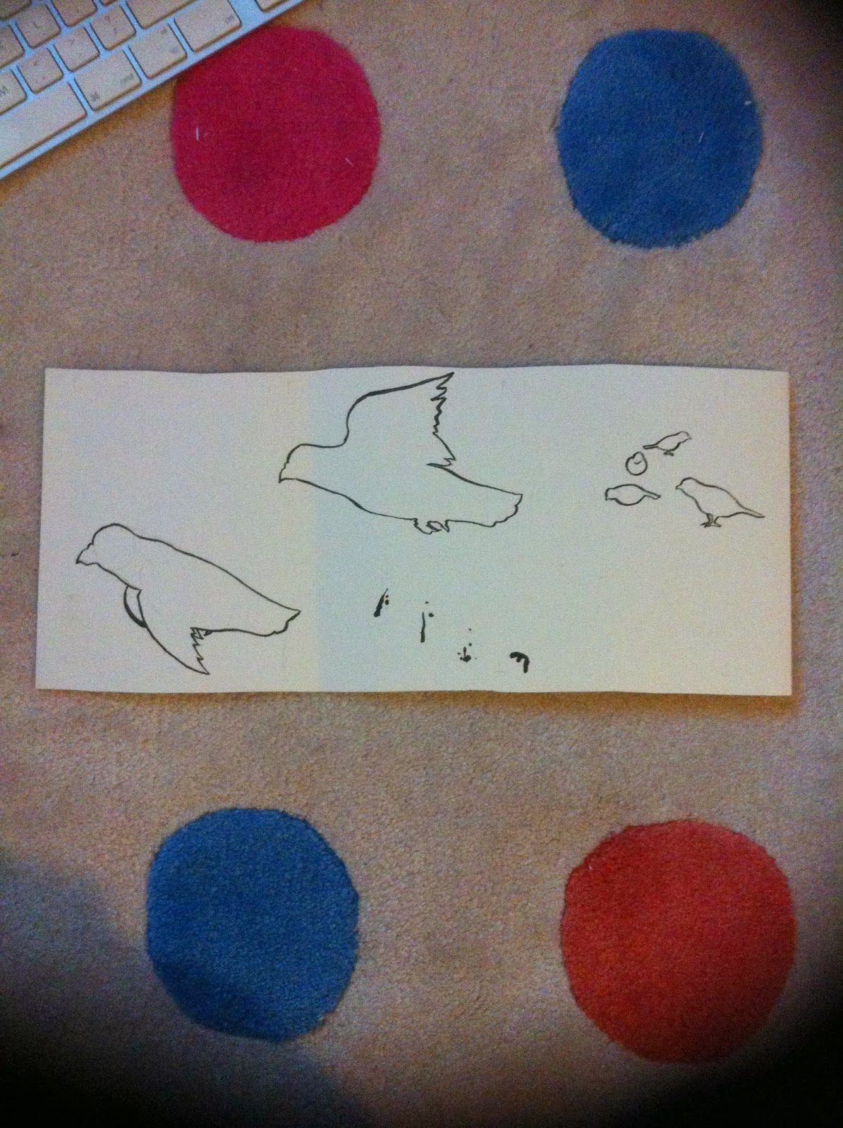
Today I drew the outline images for my book. They however look very incomplete at the moment as there will be a lot of work done on Photoshop with many pages replicated and altered slightly to represent movement etc.

I am very happy with my lifework and I hope the halftone compliments it.


08/01/2014

A Book of...: Book Design and Layout

I've come to a decision about the format I want to use for my book. I want to make a concertina book, which I think it'll be interesting to use as I'll be able to create a book that opens page by page, but it will also open fully to show the whole narrative. I then made a plain mock up of the book to give me an idea of how difficult a process it will be creating it.


I then went about planning out how my story would go on this concertina format. I've added a few more images here as there will be more pages produced than if I had just created two hot dog fold books and stuck them together.


Also, after a bit of thought I decided that I want to screen print. To create an interesting array of tones and colours with a limited colour palette I plan to use Photoshop and it's halftone technique. I will use my brush pen to create outlines for my images before scanning them in to be altered in Photoshop. My decision to use halftone comes from my experimentations with it from my Visual Language module.

07/01/2014

3D and Lens

Today Matt introduced us to Studio Brief 2 and 3D. We were given the task of making a 3D illustration.

Here are my brainstorming ideas. I need to give some thought to what will be both simple to produce but also be visually effective.


05/01/2014

A Book of...: Draft Book

Before Christmas we were shown how to create a Hot Dog Fold book in Visual Language. It's a very simple technique that can be used to create small books using 'A' format sheets of paper.

I decided to use this format to create a draft version of my book. I created a loose narrative within the book that I linked together with minimal text. I would ideally like not to use any text at all but feel it is necessary here as to explain that pigeons are a bird that should be sympathised with as they represent our 'throw away' attitudes in society.

Due to our book having to consist of a minimum of 16 pages I had to create two books for the draft.


04/01/2014

A Book of...: Scamps

I'm almost at a stage where I'm ready to begin making a draft of my book. So today I filled the remaining pages of my development book with a series of scamps that will hopefully help me create a book of fully realised illustrations.

Instead of drawing just one image on each page I did two, of differing angles, to help my understand which would work best.